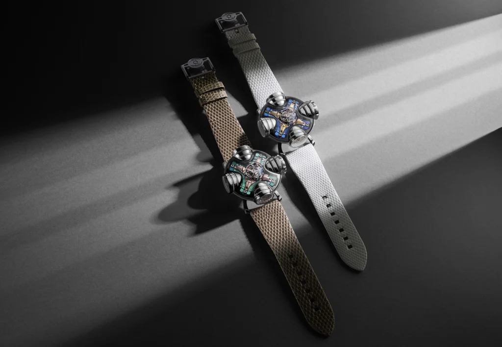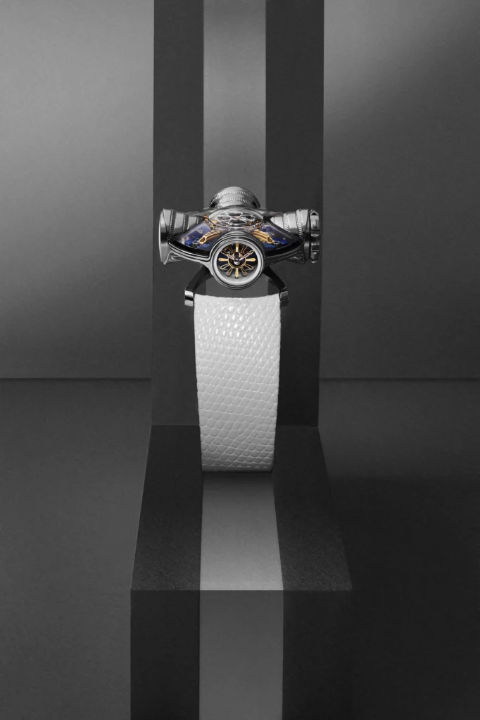

Two years ago, MB&F’s Horological Machine collection found its groove again with the release of HM11, an architecture inspired time-telling pod that rotates atop your wrist. This was exactly the kind of approach that made these watches so compelling in the first place, and as they’ve done in the past, MB&F are now revisiting the concept with a new thematic framework, this time centered around the idea of Art Deco. There are two designs being put forth here, one in blue and yellow gold, and the other in green and rose gold, and both preview the versatility of the HM11 design in different ways.
The original HM11 was conceived of by Max Busser, and designed by the prolific Eric Giroud, who looked to “neo-futuristic architecture of the 1960s and ’70s” to flesh out the wholly unique case design. For this latest iteration, the design comes from Maximilian Maertens, who has shifted that inspiration to 1930’s Art Deco. While the new theme may not be immediately evident at a glance, there are plenty of small details that have been crafted in service to this era, and when combined, they bring the HM11 to a very different place.
I want to pause here to recognize and appreciate the fact that MB&F have done this ‘one watch served multiple ways’ before, and to great effect. Once needs to look no further than the legendary HM3 for just how adept this brand is at pushing the conceptual framework of their watches into new directions with compromise to the foundation. The HM3 and HM3 ‘Frog’ were a revelation, and it’s something they’ve followed through on time and again, even in the form of collaborations with the likes of Alain Silberstein.
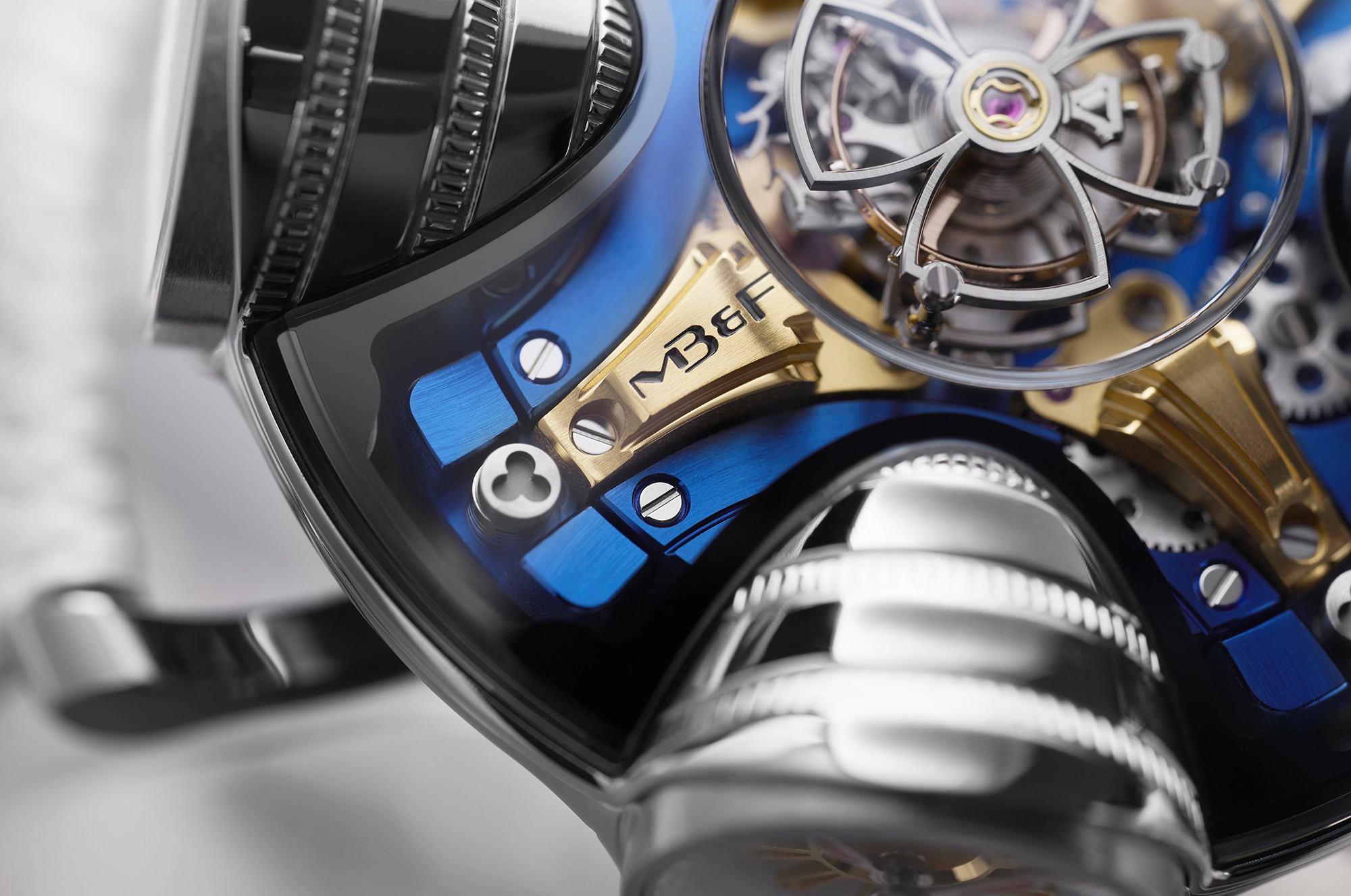
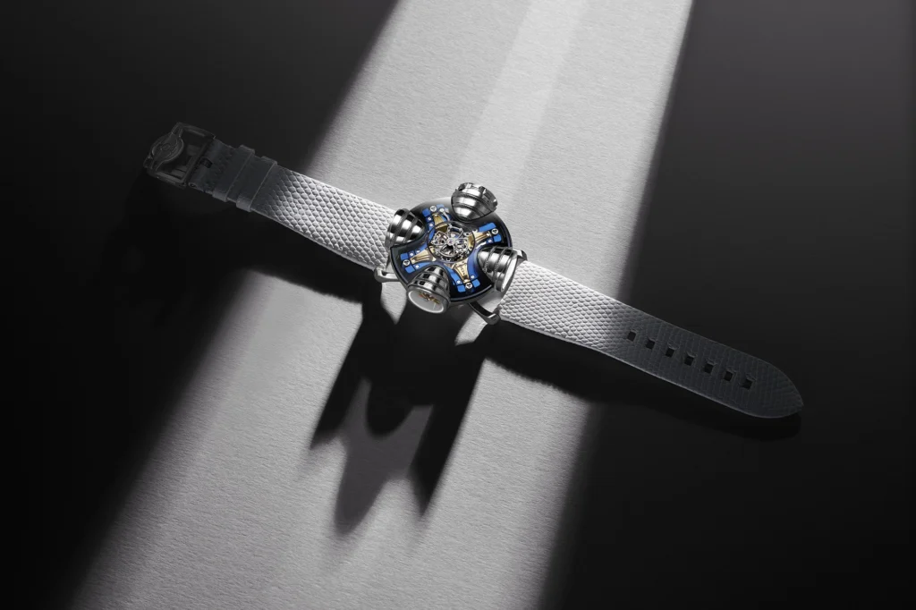
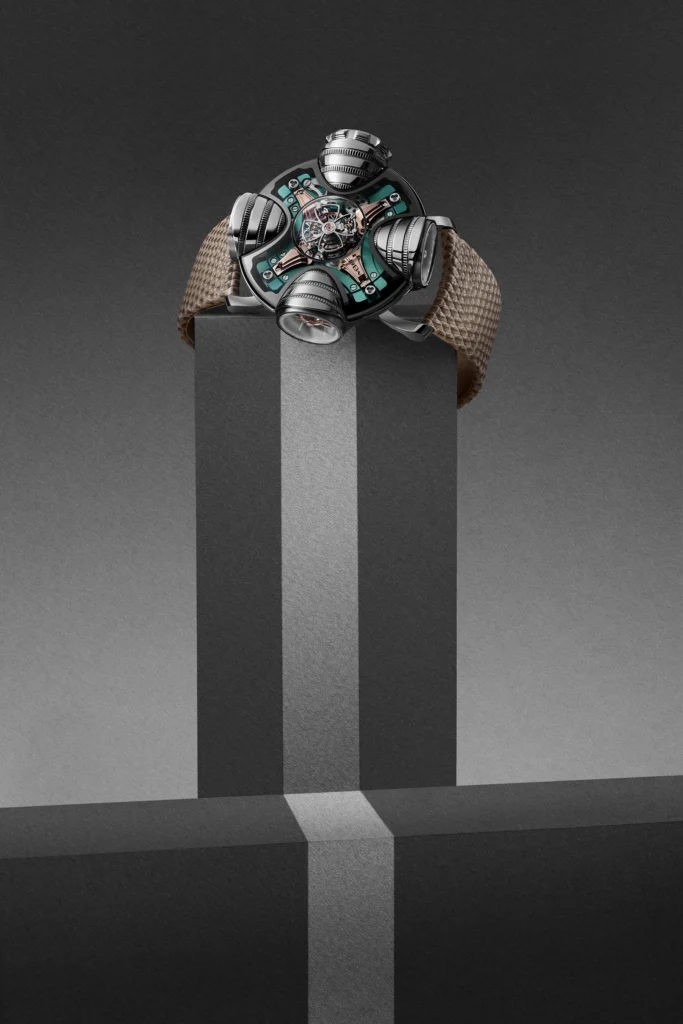
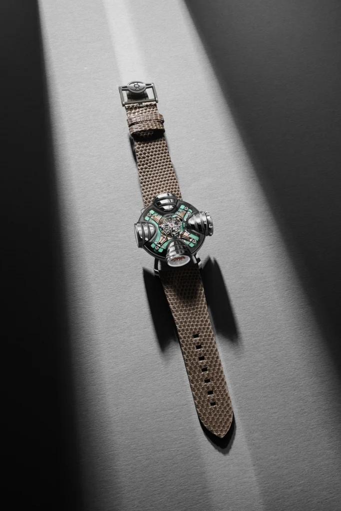
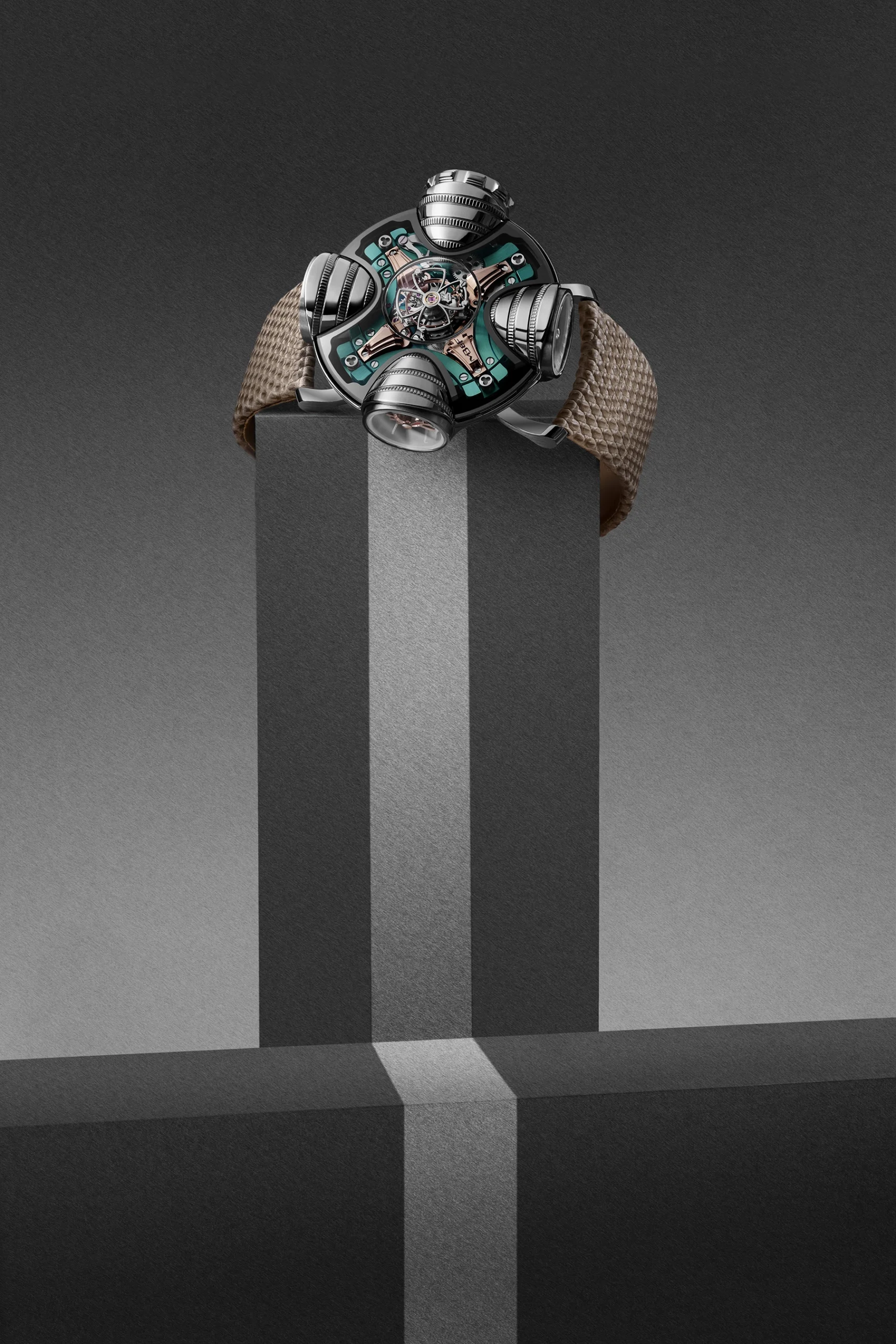
When placed in that context, the HM11 Art Deco feels slightly conservative in nature, but I think that speaks to just how complex the original design is in nature. The general form remains the same, with a central saucer-like form hosting four large pod structures. Here, the structures are now imbued with coin edge texture lines to break up the smooth polished surfaces. This represents the biggest visual change at a glance, and leans into the maximalist tendencies of the theme.

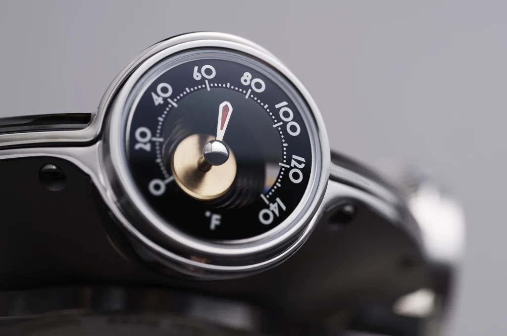
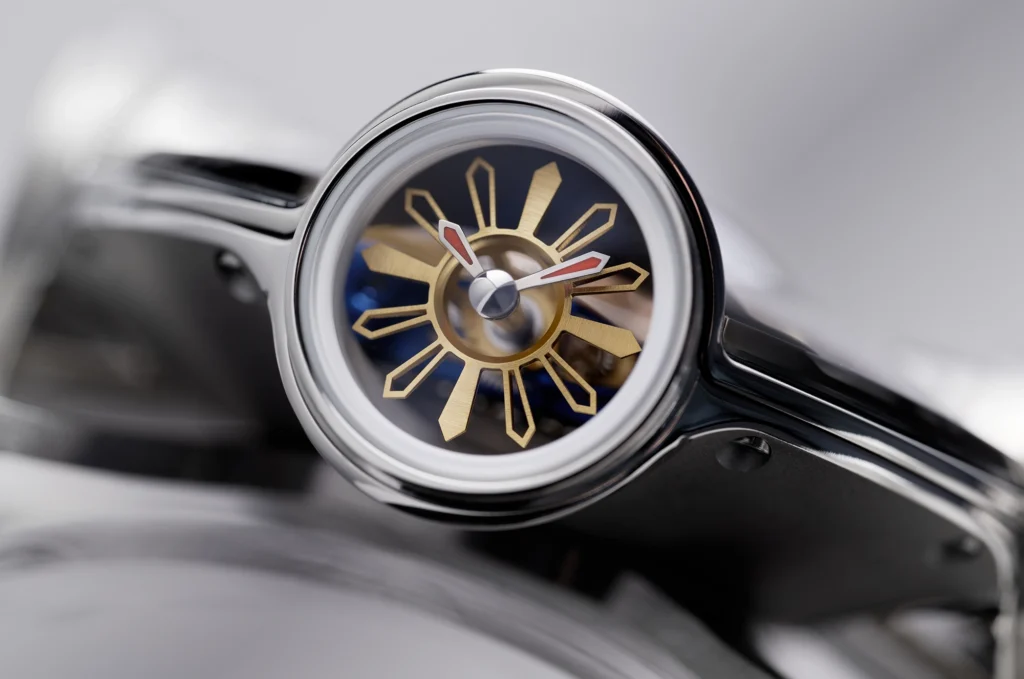
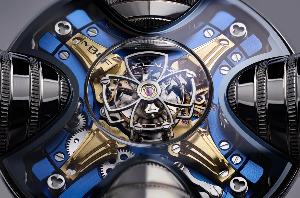
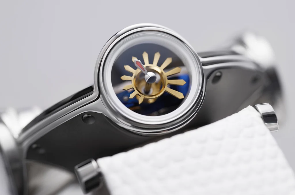
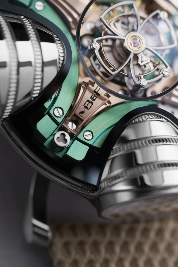
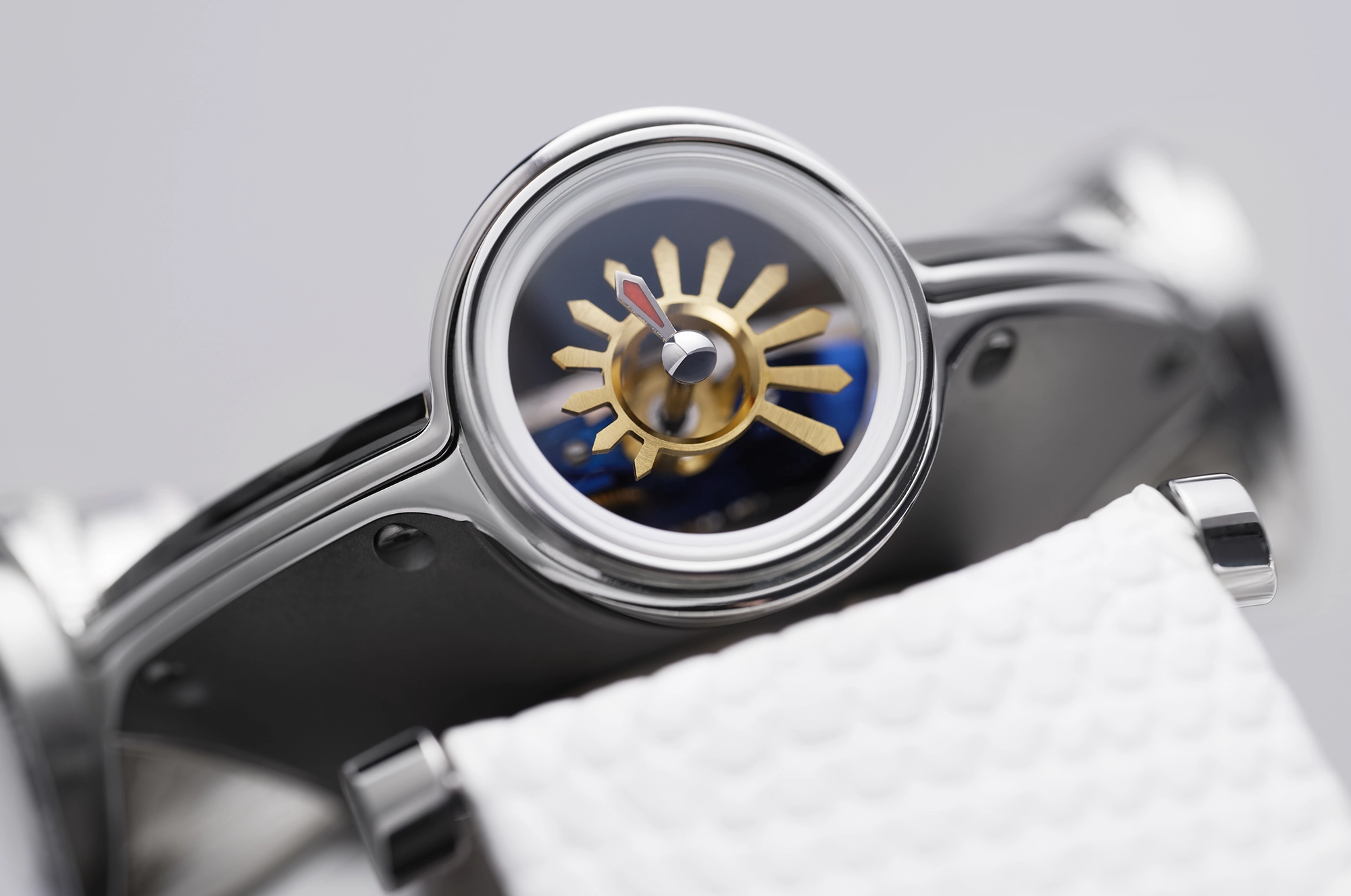
The aperture of each of the pods is where the real changes can be found, with each of the “dials” featuring art deco styles details in the form of the hands and numerals. Functionally, things still work the same way, with the body itself rotating into different positions to accommodate the wearer. The whole thing is built into a titanium frame, with a flying tourbillon set at the very center. This is a visual cacophony of interesting finishes, colors, and shapes that challenge any conception of what a watch needs to look like, and it’s exactly why we love Horological Machines.

MB&F will make just 10 of each colorway, totaling 20 pieces in celebration of the brand’s 20th anniversary. Pricing is set at CHF 198,000. More details at MB&F.