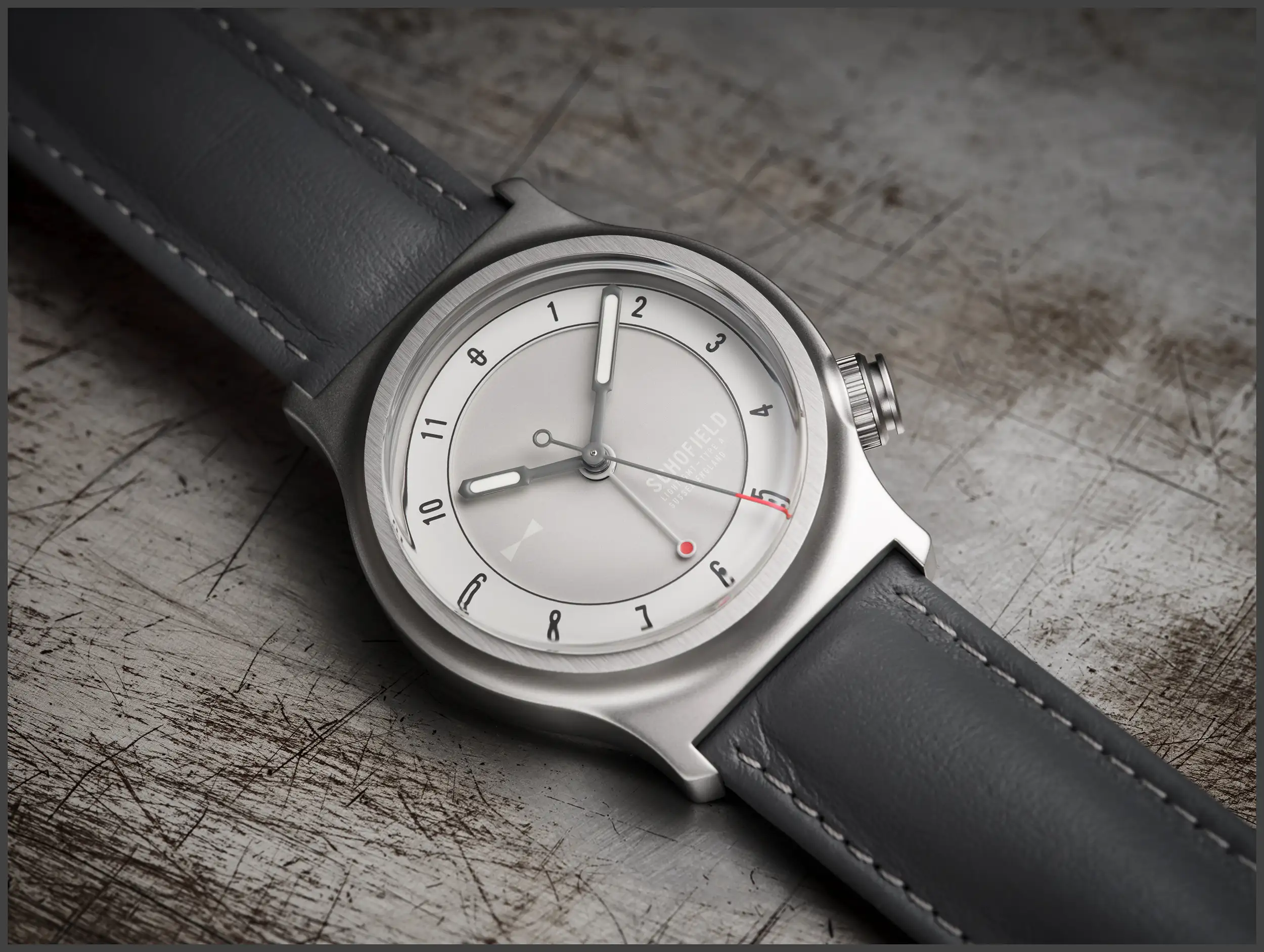
The Schofield Watch Company is an enigmatic British brand that’s known for their lighthouse inspired design motifs, and long term commitment to sustainable business practices. They are also known for using a single case architecture since their inception in 2008 and launch in 2011. The case, while quite unique and distinctive in design, featured a towering top section and 44mm diameter that keep it just outside of broad approachability. This year, Schoefield is bringing that same level of thoughtfulness in design to a new case forming a new collection called simply, Light. The name is a nod not only to the lighthouse concept driving the brand, but also the trimmed and focused approach of the new collection to keep things simple and accessible.
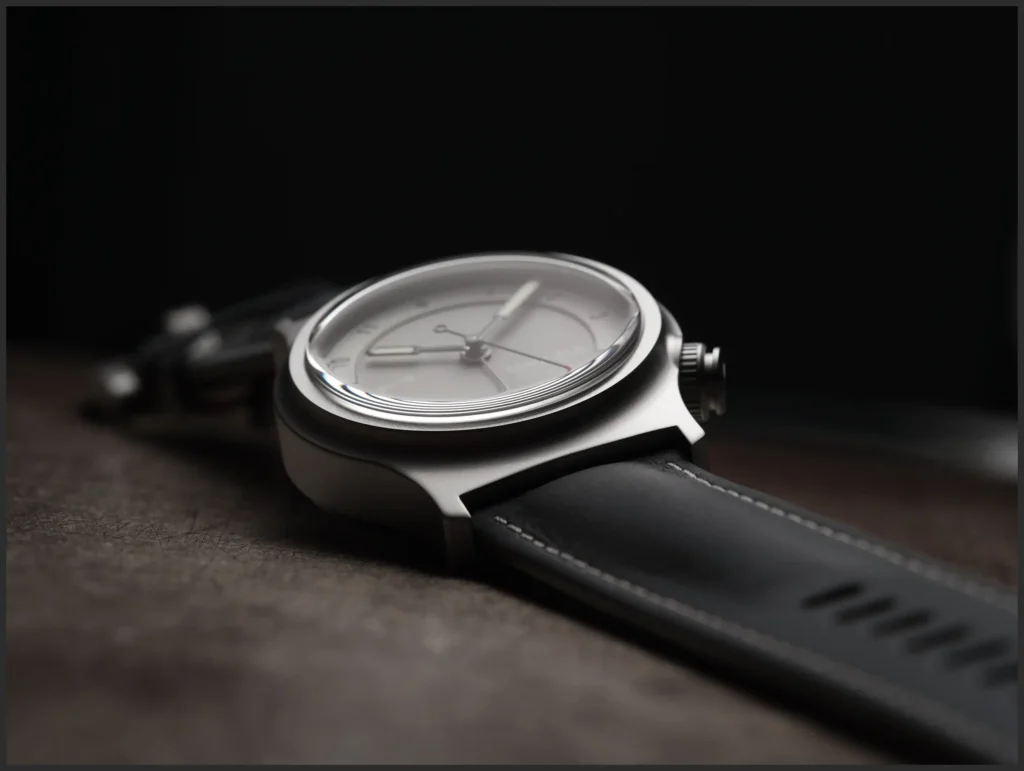
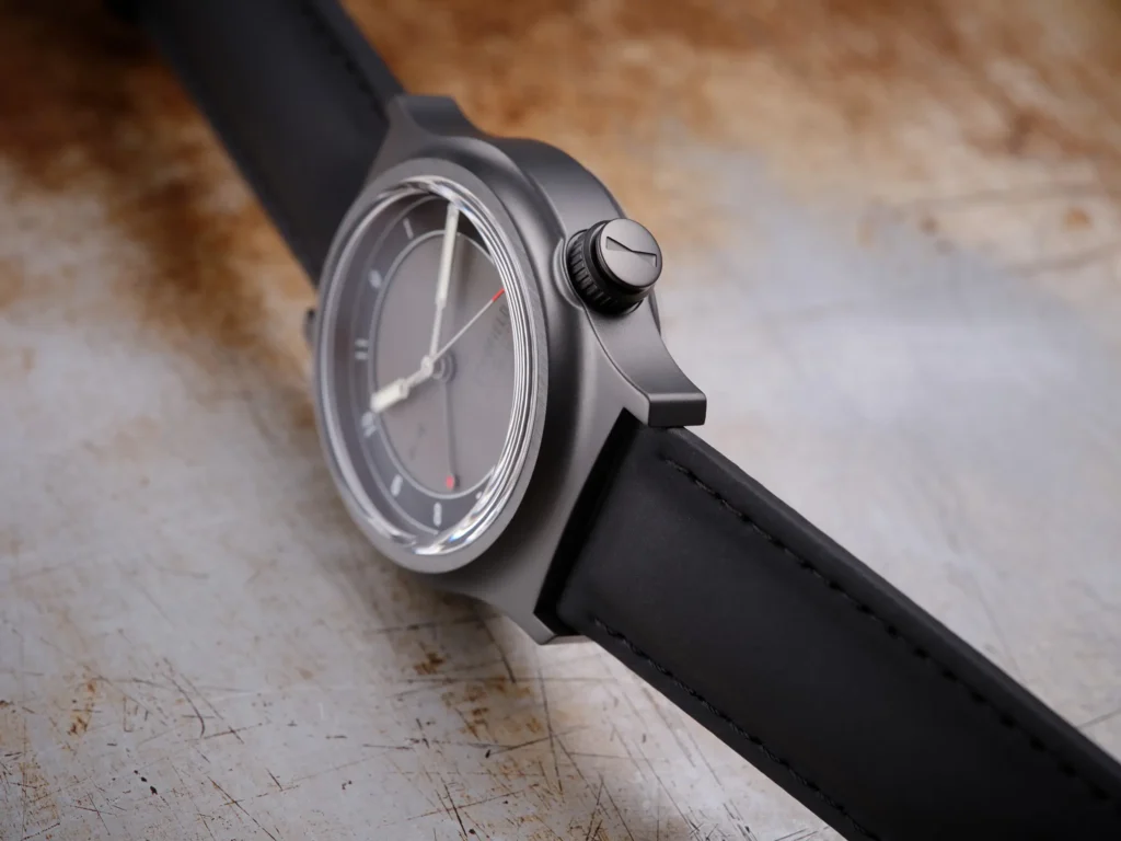
The Light watch is being introduced with 2 variations, one in brushed steel called The Light One, and another with a black PVD coating called The Dark One. The new case measures 40mm in diameter and 48mm from top to bottom. A high box sapphire crystal makes for a 13.5mm thickness measurement, but all these numbers don’t quite take into account the other unique qualities of this case design. It may have a smaller footprint, but there’s still plenty of drama in this design that remains high on impact.
The case features soft lines and free flowing transitions between surfaces, with a raised section forming the bezel in a seamless fashion. Small lug structures hang off the flat top and bottom sections that fit a 22mm span, with no breaks in the transitions. This is a case that will encourage you to observe it from every dimension to get a sense of its design as a whole. A crown is beautifully integrated into the case at 4 o’clock, and even the design of the crown itself begs a closer look thanks to its different sections at top and bottom.
This unorthodox case shape and design may be polarizing, but it’s exactly the kind of innovation that makes small independent brands so compelling. This watch may live outside of your comfort zone, but it’s a direct challenge to conventional field watch wisdom, and feels all the more exciting as a result.
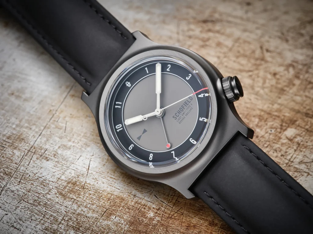
The dial design is kept simple and clean, with a raised track around the perimeter hosting each hour. A subtle beam-of-light logo is applied at 9 o’clock, while the branding is reserved for the bottom right hand portion of the dial. The asymmetric design is legible while being careful not to create tension with the case. There is a 4th hand at work making a lap of the dial every 24 hours, but there is no 24 scale on the dial, which is an intentional aesthetic choice.
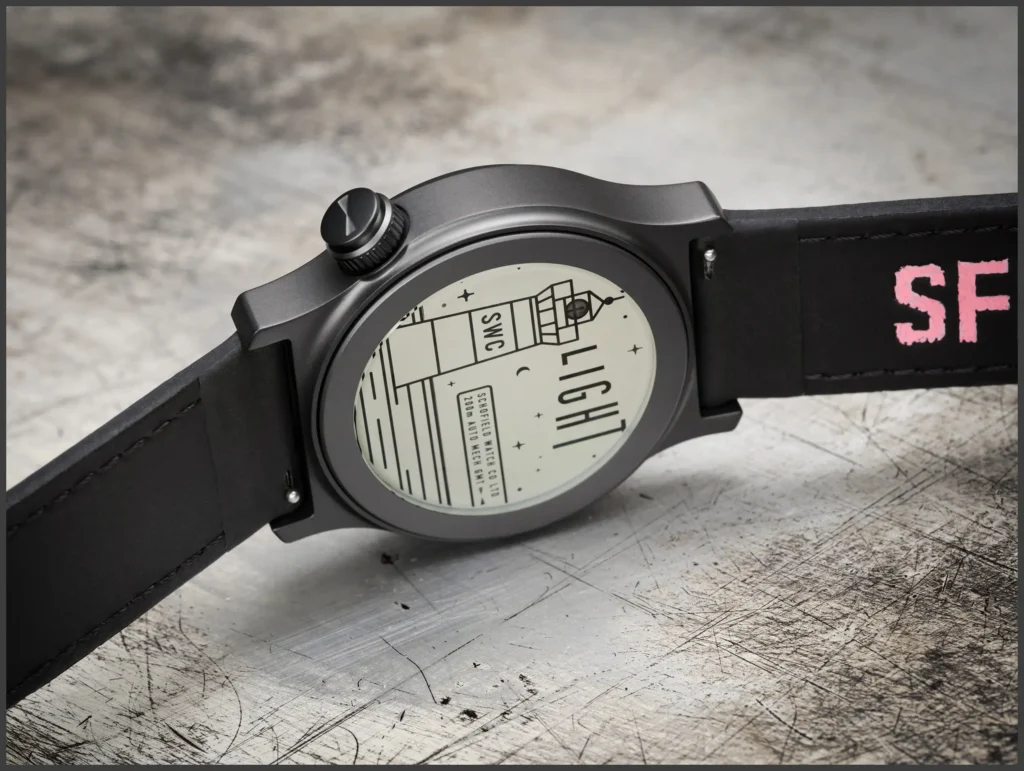
Schofield is using a Seiko NH34A automatic movement inside the Light watches, in an effort to keep the cost in check. The Light is priced at £1,825 exclusive of VAT, which equates to about $2,300 as of this writing. My hope is that this is just the beginning for this new collection, and that we’ll eventually see other colorways and materials enter the discussion. You can keep up to date with Giles of Schofield on their new podcast, Sometime, or simply visit the Schofield website.

