I generally enjoy focusing on the practical elements of a watch. The details that make me want to wear and use the watch for its intended purposes. Sometimes this can lead you to unexpected and exciting paths (like learning how to dive), and just as importantly, means you will build more lasting memories and sentiment toward the watch. It’s like your own personal lore. This is the kind of thing we romanticize when we find vintage Submariners that were bought in service with a documented exciting provenance. It affords us a connection with a watch that’s just not possible if it’s stuck in a safe somewhere. Behind all of this, however, there is an aesthetic consideration that must be understood, even for the most ardent ‘use your watch’ types.
This is most apparent in the vintage phenomenon that grasped the watch industry over the past decade or so. Not only were new watches made to look like old watches, as if they had a lifetime of experiences built-in right out of the box, but even actual old watches began to be marketed for their unique beauty, brought on by age. I’m talking about the orange and yellow shades brought on by years of use and abuse (or simply sitting in a drawer, perhaps), cracked dials and faded bezels… these have become prized features, not just for the stories they may tell about the watch, but for their aesthetic beauty.

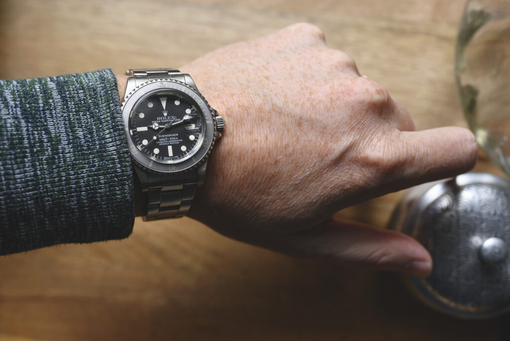
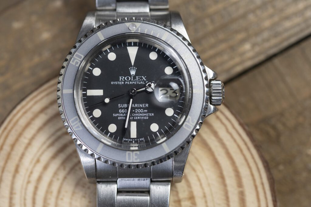
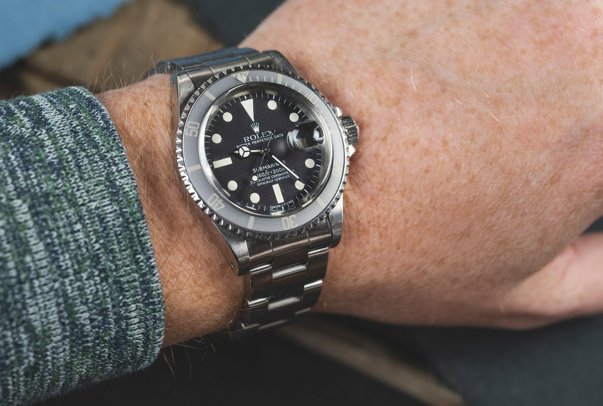
Being concerned about such things flies in the face of the stance that watches are practical tools and are to be used as such. Who cares what it looks like. But then again, we do. Sometimes these watches can be beautiful in their own way, and indeed this aesthetic connection can deepen our relationship with a watch. The ghost bezel on the Submariner reference 1680 pictured above is a perfect example. It’s not adding any practicality, in fact it might do the opposite, but it looks unique and beautiful, and tells a story about the age of the watch. But in reality, it often doesn’t. These bezel inserts can be bought and swapped into an assembly purely to get a desired look.
Likewise with slightly earlier (serials roughly between 2.07M and 4.0M) 1680 references that feature a red line of text at the bottom of the dial. This of course adds no practical advantage to the watch, but it’s a highly sought after dial for its unique look. They aren’t even that much rarer than white 1680s. There is no sense to be made of the premiums collectors are willing to pay for these watches, especially if your goal is to use the watch as it was intended.

As much as I enjoy picking apart the practical components of a tool watch, I must admit that I also find value and meaning in the aesthetic. These ideas can and do co-exist and even if we end up building a lifetime of adventures and real-world-use with a watch, the look we get as a result is often the reward.
If you’re looking for your next or even your first tool/go-anywhere-do-anything watch, don’t get bogged down in the technical details alone. No watch is perfect, and chasing that ideal will often end in disappointment. It’s important to balance your practical needs with your own sense of style, as that’s what will keep you reaching for that watch day in and day out, and ultimately keep you smiling every time you need to check the time.

