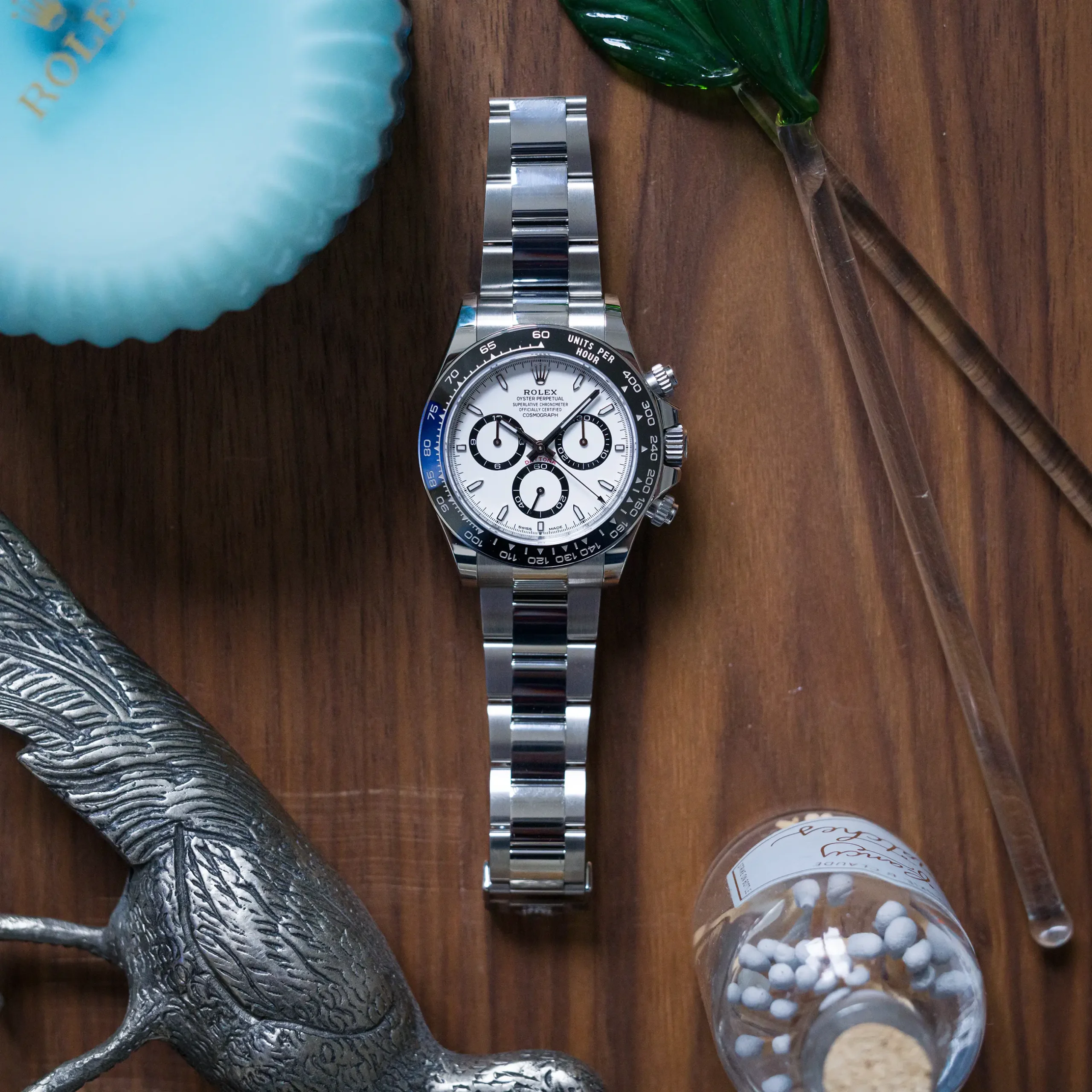
The Rolex Daytona turned 60 last year, and this is one anniversary that Rolex didn’t let quietly slip by (sad Explorer II noises). In fact, the Daytona had what could be considered its biggest year ever, certainly in the modern era. Not only did we get a new generation of the watch in the form of the 12xxxx references, we also got what is arguably the greatest single special edition of a modern Daytona ever in the 126529LN ‘Le Mans’. The new collection represents the first real reset the Daytona has seen since it tacked on an extra digit to the reference, and ditched the modified El Primero movement for an in-house caliber, the 4130.
The new Daytona collection hosts a considerable amount of small changes that add up to an appreciably different experience from the prior generation, but it’s still easily recognizable at a glance. Rolex takes an evolutionary approach when it comes to ‘new’ watches, in more ways than you may realize, and the new references are no exception. That doesn’t mean that the changes we did see didn’t go without raising a few eyebrows.

Following up on the success of the 116500 would be no small task, but the changes that Rolex does manage to tease out of the 126500 create a clearer through point to the watch’s heritage. Any single change could be viewed as unnecessary, however they pick up many of the notes that made the watch great from the beginning, and as a result, place the prior two generations into what could be considered outlier territory for their deviations from this formula. What exactly is this formula? Well, I’d suggest that it could be defined in multiple ways depending on who you ask. Let’s get into it.
In order to gain a full appreciation for some of the changes made in the latest Daytona, it will be helpful to first take a step back, and touch on some of the defining elements of its past. That’s because Rolex has taken cues from older generations to bring the Daytona a bit closer to its original look and feel (though not all of the changes made have this effect). Rolex isn’t exactly known for rehashing their past, for better or worse. They are a brand that typically moves in one direction, at times they appear painfully unaware of their own heritage. But that started to change in recent years, with small hints of their history appearing in new references.
There are two specific examples I’ll point to here, each of which came as a surprise upon release, signaling a potential shift in thinking. The first was the release of the Sea-Dweller reference 126600 released in 2017. This was a new modern Sea-Dweller at 43mm with a Cerachrom bezel and even a cyclops over the date (a first for the Sea-Dweller), so it wasn’t exactly old-school in appearance, but there was one detail that was a clear nod to the watch’s past: a single line of red text at the bottom of the dial.
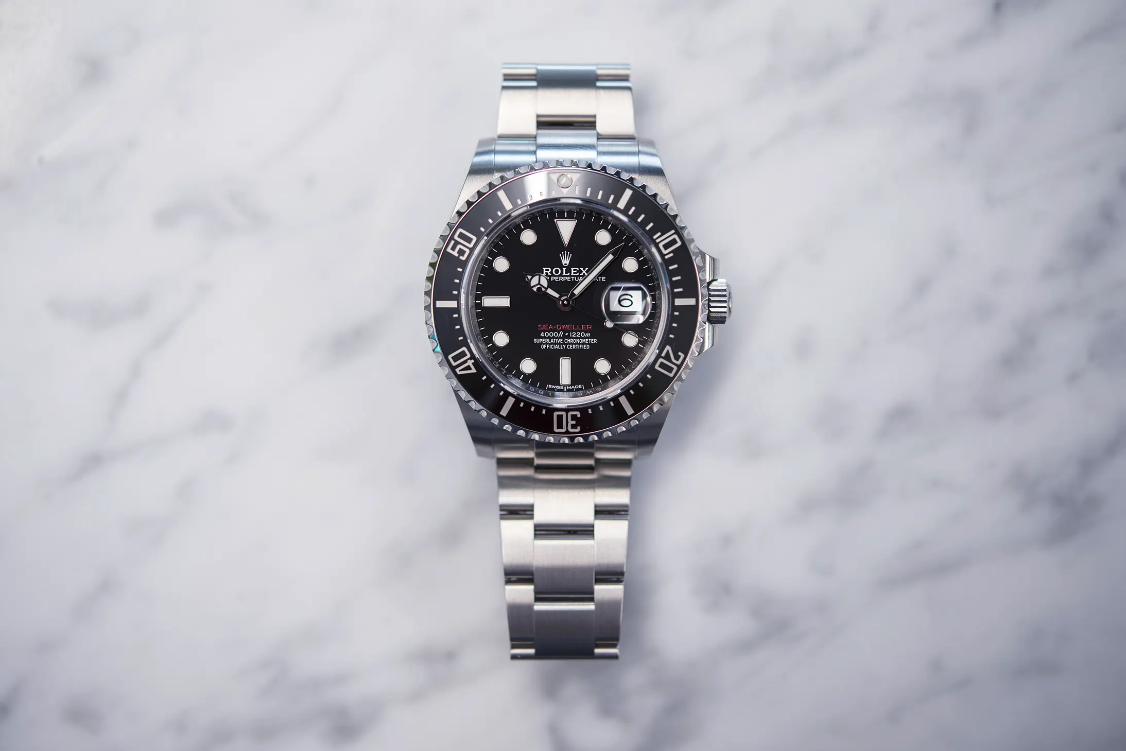
The Sea-Dweller has a fascinating history that dovetails with the US Navy’s SEALAB in the late ‘60s, and while that’s a story for another day, the prototype dive watches from Rolex gave birth to the production Sea-Dweller, and these rare watches featured a single red line of text on the dial (the first production Sea-Dweller ref. 1665s had two lines of red text). Likewise, when the Submariner first received a date complication in the reference 1680, they also used a red line of text for the model designation at the bottom of the dial. This would be phased out around the 4.0M serial number range (~mid ‘70s), making it a hallmark of a very specific era of Rolex dive watches. Rolex making a return to this aesthetic choice (a welcome move, if you ask me) was a clear nod to this era, and one that didn’t inherently come with any practical benefit.
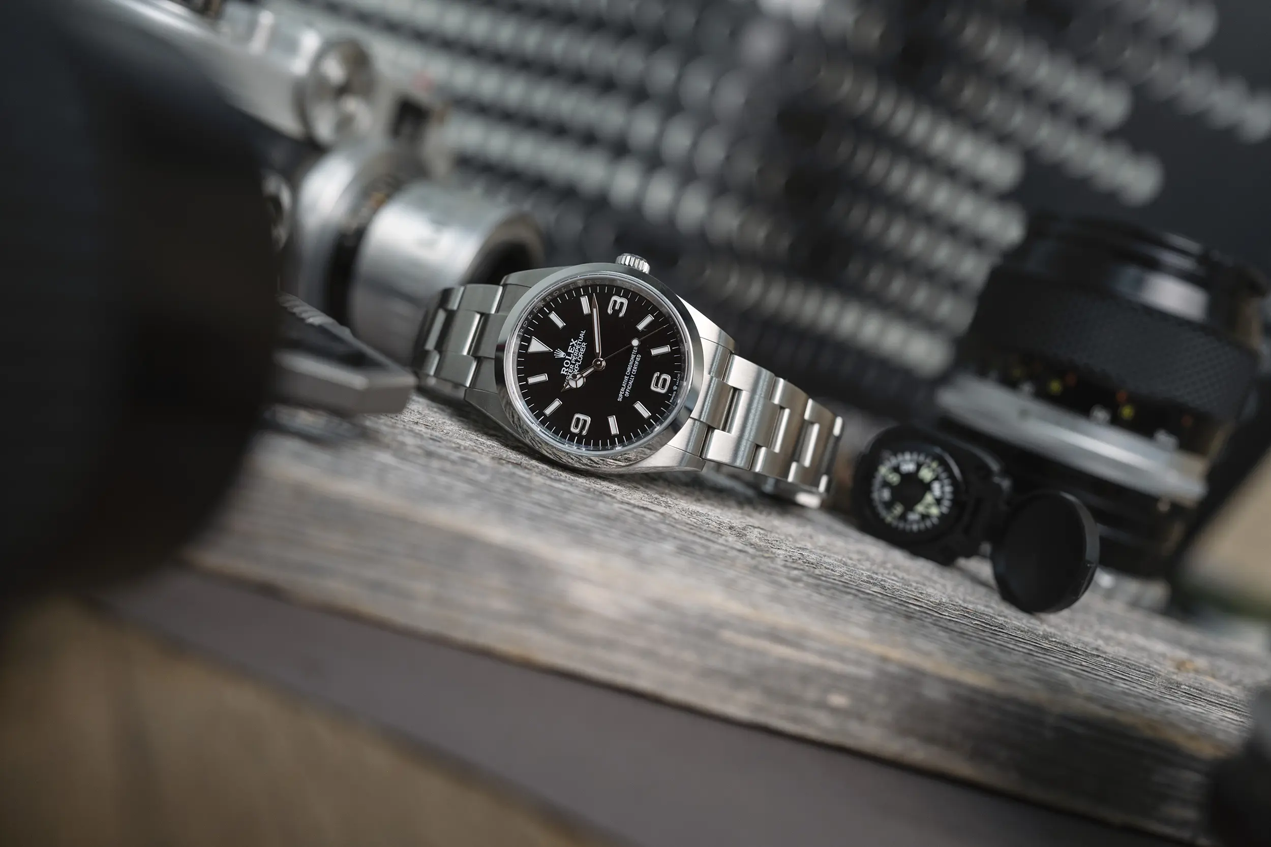
The second example was the release of the Explorer reference 124270 in 2021. This reference moved the Explorer back to its original 36mm dimensions, and phased out the 39mm 224270 in the process. In hindsight, this move makes more sense knowing that a 40mm variant would be added to the collection, but in creating a modern 36mm Explorer they fully embraced the historic size and fit of the watch. This was a hugely surprising move to me at the time, because this did make a practical difference in everyday use, and shifted the market of buyers for the watch considerably. A year later we saw a new generation of the Submariner get a slimmer lug profile, more closely resembling the earlier case designs, and at this point it was clear that Rolex was indeed dialing back some of their modern design choices that could have been seen as going too far. They brought these watches back to their roots, in a way.
This trend sets the stage for the new Daytona collection released in 2023, which continues with this philosophy in a few important ways. The Daytona is a different beast compared to the Sea-Dweller and Submariner, serving as the flagship sport watch from a brand known for their sport watches, nevermind all the modern hype-driven baggage, it’s been that way for generations. As such, the small changes made from generation to generation are often subject to a different kind of scrutiny. This would especially be the case coming off of what has been the most popular Daytona reference ever in the 116500.
Rolex is attempting to walk a narrow line with the new Daytona, keeping enough of the magic from the wildly popular 116500, while applying the same formula outlined above of bringing the watch ever so slightly back in line with its past. The most prominent detail that launched the 116500 into the mainstream was the application of a black Cerachrom bezel, capturing a look that had been lost since the ‘80s in the transition to the 5 digit reference 16520. The 4 digit references prior had offered both a steel bezel option in the reference 6265, and a black acrylic insert in the reference 6263.
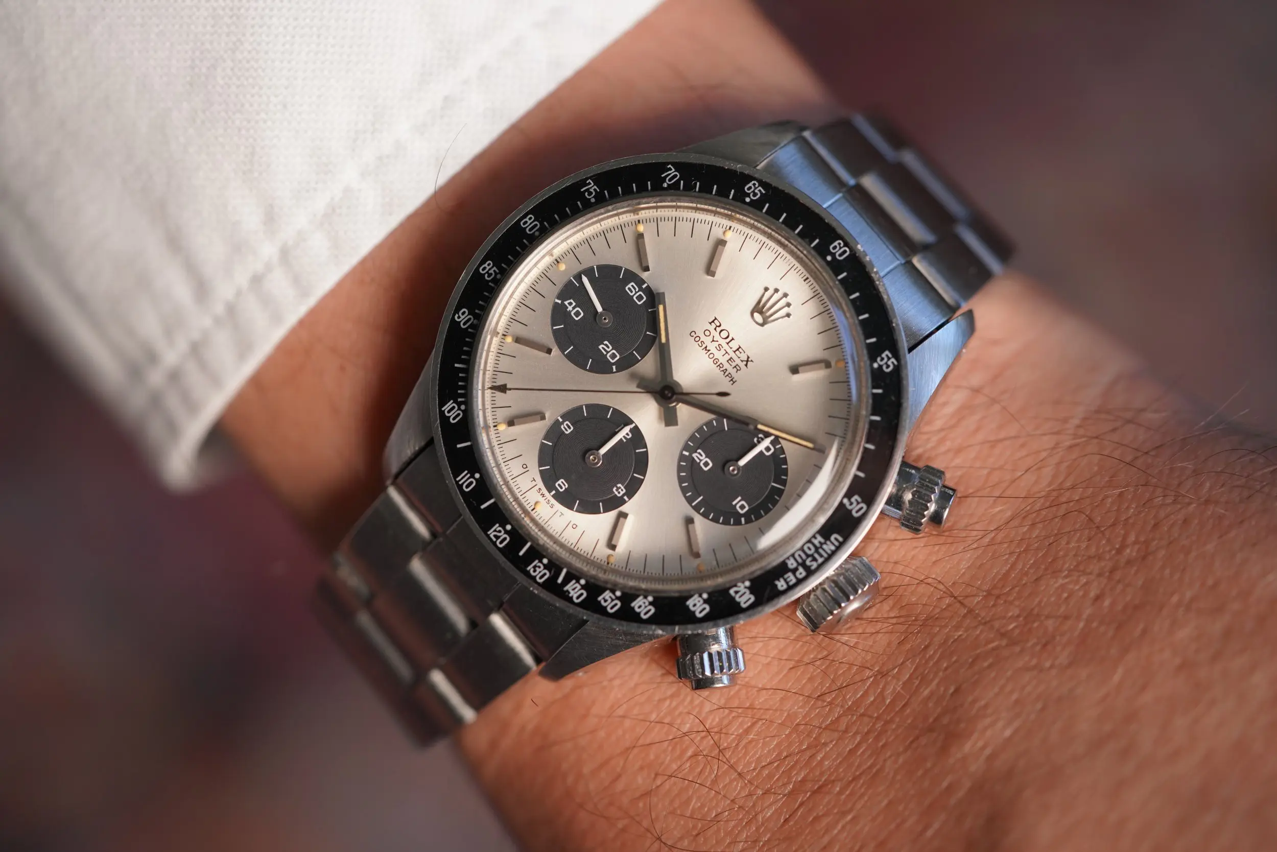
(A quick note to mention that the 116500 was not the first Daytona to receive a black Cerachrom bezel. That would come in 2011 in their usual usage of precious metal references to bring such features to market in smaller numbers. The 116500, introduced in 2016, was the first steel reference to get a black ceramic bezel.)
Keeping that bezel would be key to retaining that high-contrast look that has captivated a new generation of enthusiasts, and while it’s not preferred universally, it’s proven hugely popular in revitalizing the Daytona as a modern sport watch that’s more than just high-polish jewelry in appearance. Unsurprisingly, Rolex has stuck with the black ceramic bezel in the 126500, but they’ve changed up the execution just enough to create a visual difference, as well as provide a practical benefit (according to Rolex) in the process. But there’s another benefit here of how they’ve gone about it, and that is referencing early 4 digit Daytonas with black acrylic bezel inserts, which were set into a steel assembly that left a steel lip visible around the perimeter of the bezel.
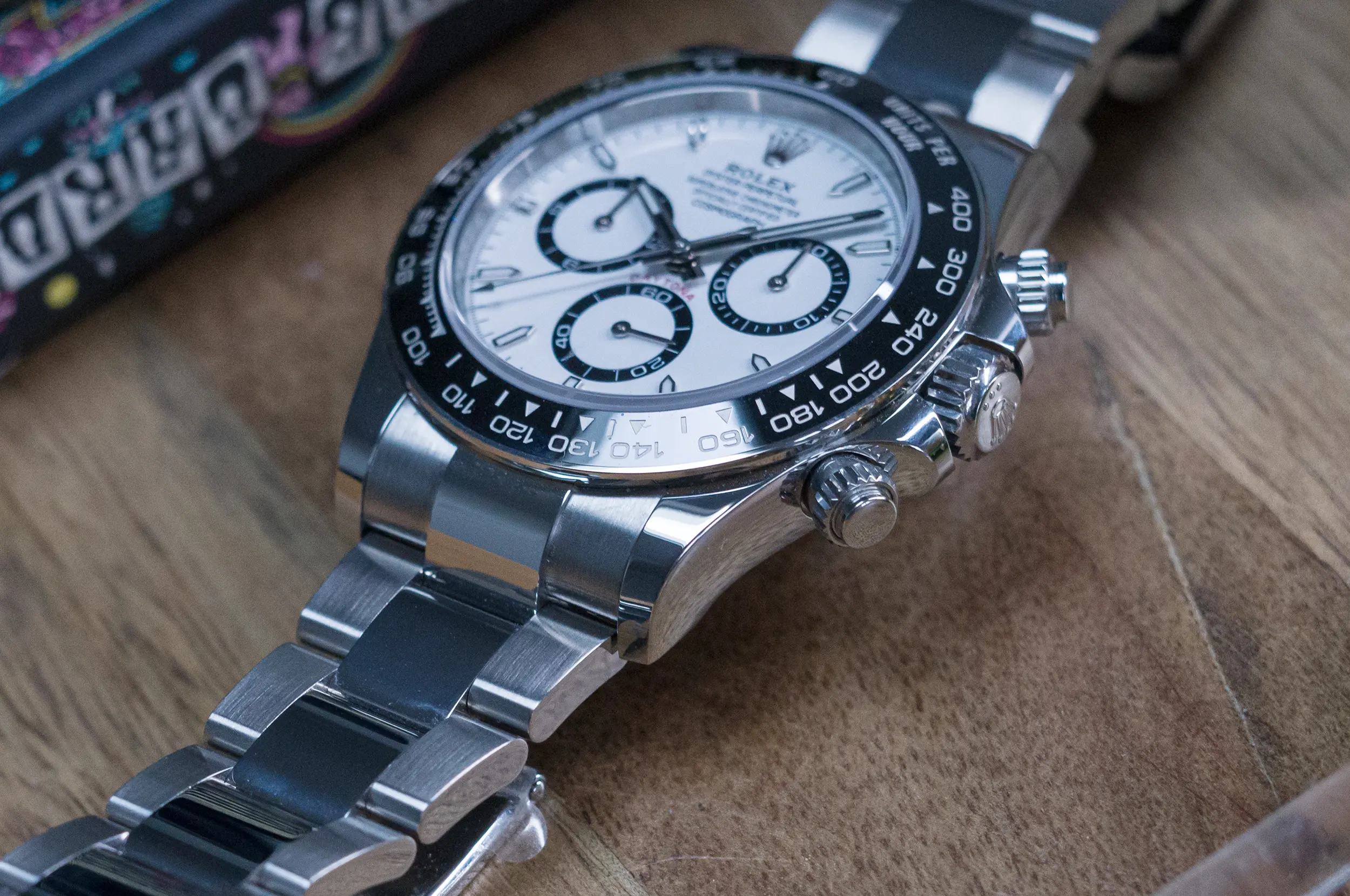
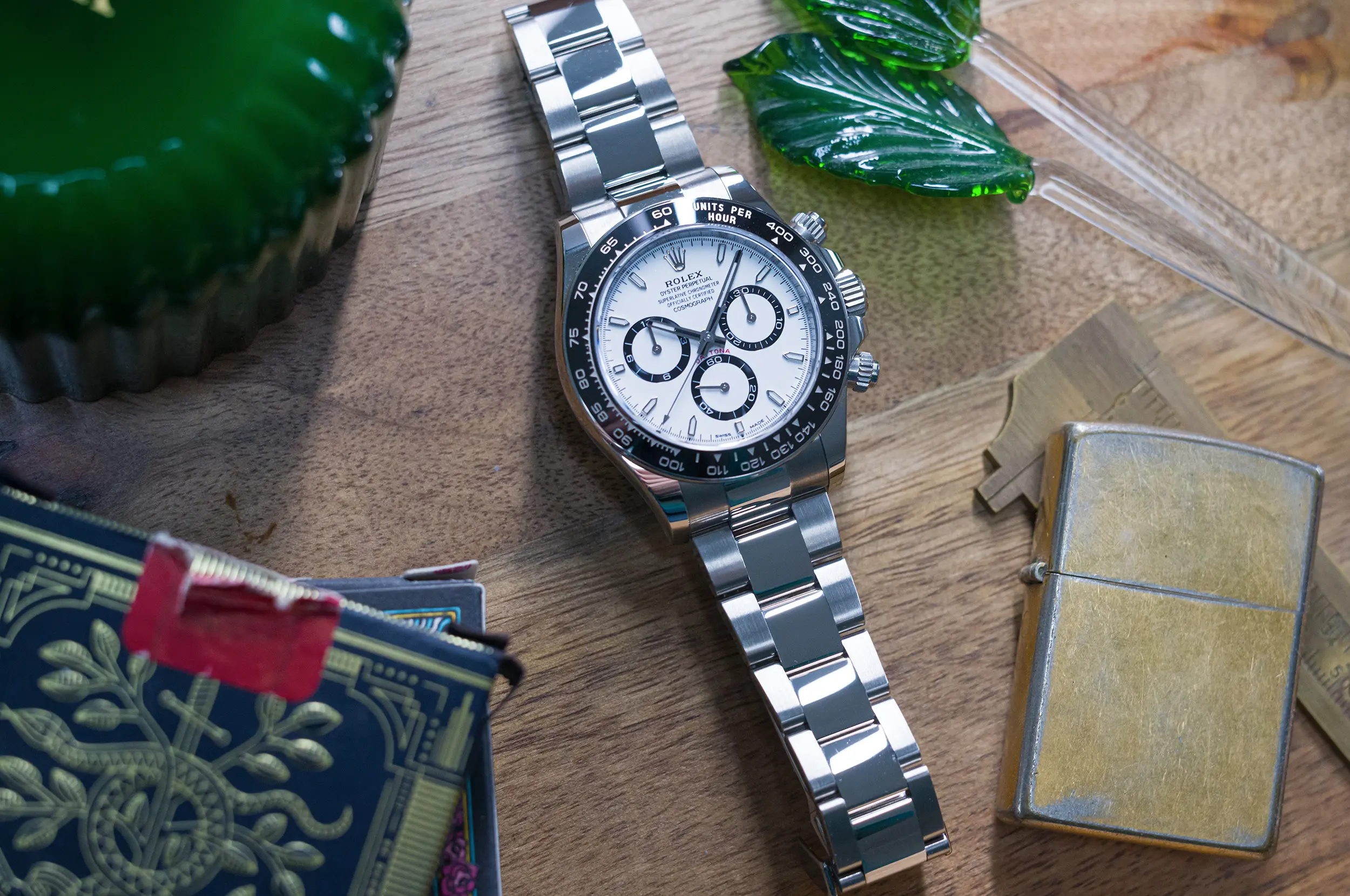
The new Daytona keeps the black Cerachrom bezel, but it’s trimmer in appearance than the prior generation thanks to the steel edge that’s been applied. Rolex claims that this is done to protect the ceramic portion from chips and cracks, but it also brings the bezel visually a bit closer to something like the 6263 (a fact that Rolex even calls out on the product page), which framed the bezel, and consequently smoothed out some of the harshness of the contrast been the black bezel and the steel case or even a white dial. To my eye, it accomplishes the same effect here in the 126500, reducing the visual weight of the black frame to bring a better balance to the watch overall.
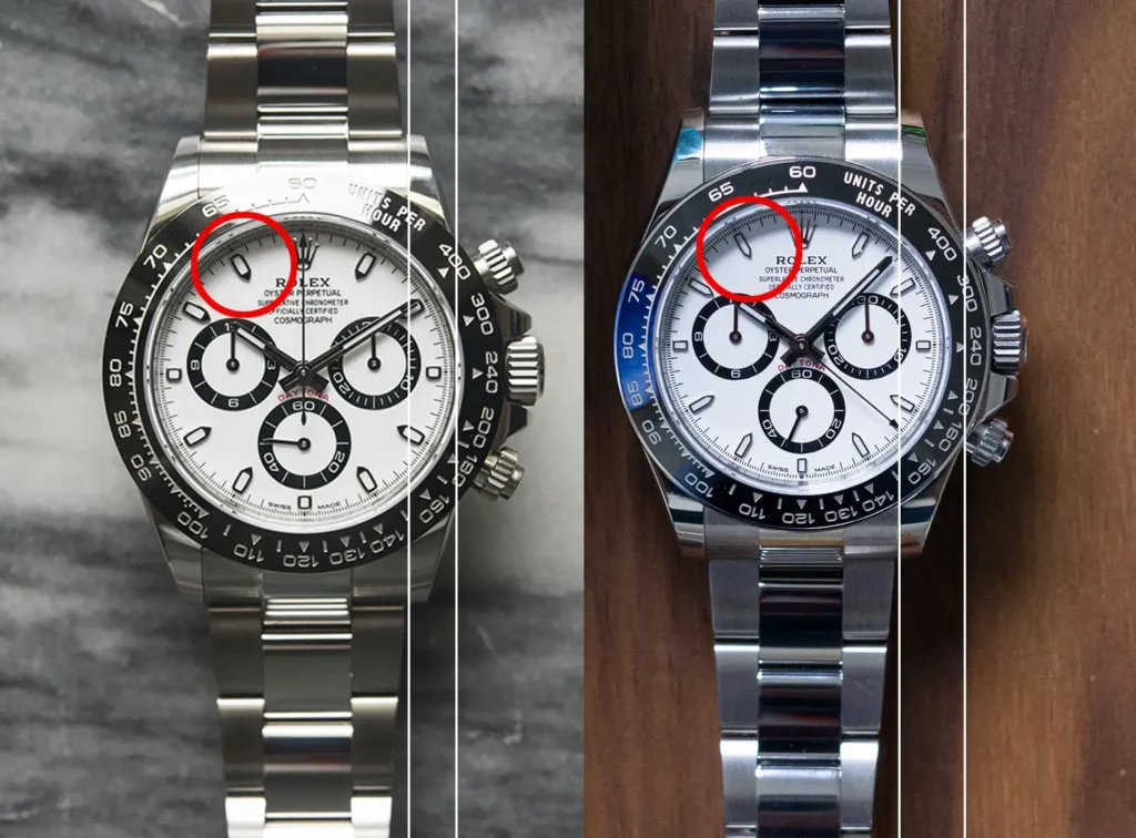
Moving the dial we find the next biggest design choice that brings this new reference a step closer to its heritage, and looks to solve one of the Daytona’s weak points at the same time. Since its inception, the Daytona has largely used stick hour markers in the form of applied bars with plots of lume set alongside. The first 6 digit Daytona references introduced at the turn of the century, the 116520, featured a new design for the hour markers, moving to shorter, wider applied units that placed a square of lume within. The 116500 retained these same hour markers, and they remained my biggest gripe with the design of the watch. They had a particular inelegance to them that I believe came down to the shape of the lume plot within the hour marker not matching the shape of the marker itself. This created a bit of dead space at the tip of the marker which never quite sat right with me. Sure, it’s a small thing, but with 12 (okay, 11) of these small things on the dial it did have an effect on the overall look, and not in a good way.
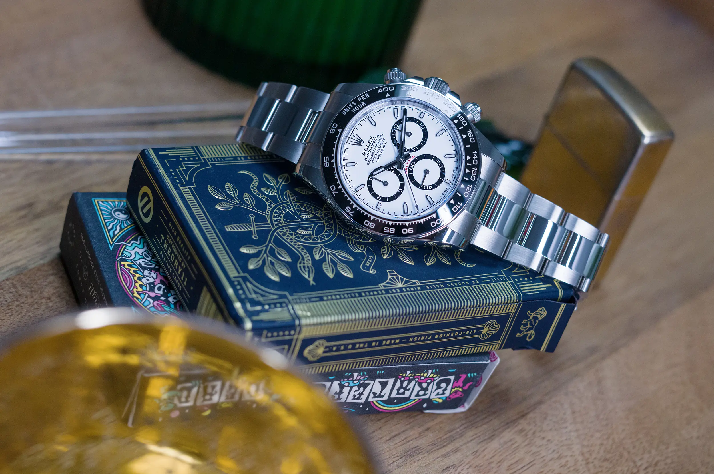
A remedy for this was my biggest hope for a new generation of the Daytona, and Rolex delivered with a new design that moves back to the long, thin markers with a vein of lume. This one move (which is actually 12 small moves) cleans up the dial in a huge way, and while the Daytona has never been known for its legibility, I believe that this has moved it in the right direction in terms of reading the time. Everything on this new dial feels like it has a bit more space to breathe, and the hour markers are a big reason why. They make way for thinner ring elements framing the sub-dials (more on that in a moment), and give your eye something to land on in reference to the hour and minute hand.
When I first saw images of the new Daytona before heading into my meeting with them at the 2013 Watches & Wonders show, my heart sank at the apparent adjustment to the rings framing the sub-dials. This was an immediate and noticeable departure from the outgoing reference, and pictures were not flattering. I also feared that the adjustment to the weighting meant a larger case would be at play, but thankfully that wasn’t the case (on paper, at least). When I was handed the watch in person, my concerns melted away. The re-proportioned rings look much better in hand than they do in images, and in truth, it’s not as big a departure as you may think. They are thinned out, and the proportions between the rings and new thinner bezel and hour markers all flew well with one another.
There is one move that we all had hoped for, and it would have brought the new Daytona directly in-line with its heritage. That would have been ditching the rings altogether and returning to the contrasting filled in sub-dials. At the moment, you can only get this kind of a dial configuration within precious metal references, and if you want it paired with the black ceramic bezel, it will have to be on an Oyster-Flex strap, as references fitted with full precious metal bracelets are bound to bezels of the same material (except in the case of the aforementioned 126529LN Le Mans). This particular configuration remains elusive in the new generation of Daytona, unfortunately. Moving to fully filled-in sub-dials in their steel references would likely take the design a little too close to the old-school look, and Rolex is still keenly aware of moving their designs forward in the bigger picture, despite their willingness to backtrack on the smaller details.
As recognizable as the dial and bezel have become, my feeling is that the true strength of the Daytona has always been its case. There are arguably more interesting chronograph watches out there, especially at the sums commanded on the second hand market, but few capture the Daytona’s magic in terms of wearability. This watch has always been fantastic on the wrist in a way that’s difficult to properly quantify, but it’s the one thing I pay attention to when they make changes to the collection. Preserving this quality is paramount for the longevity of this watch.
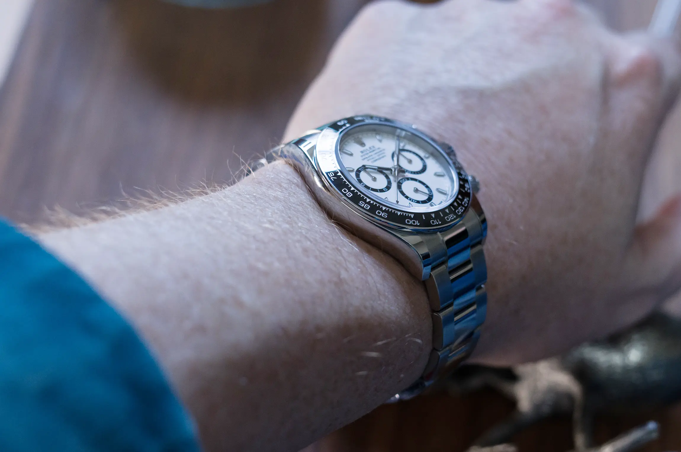
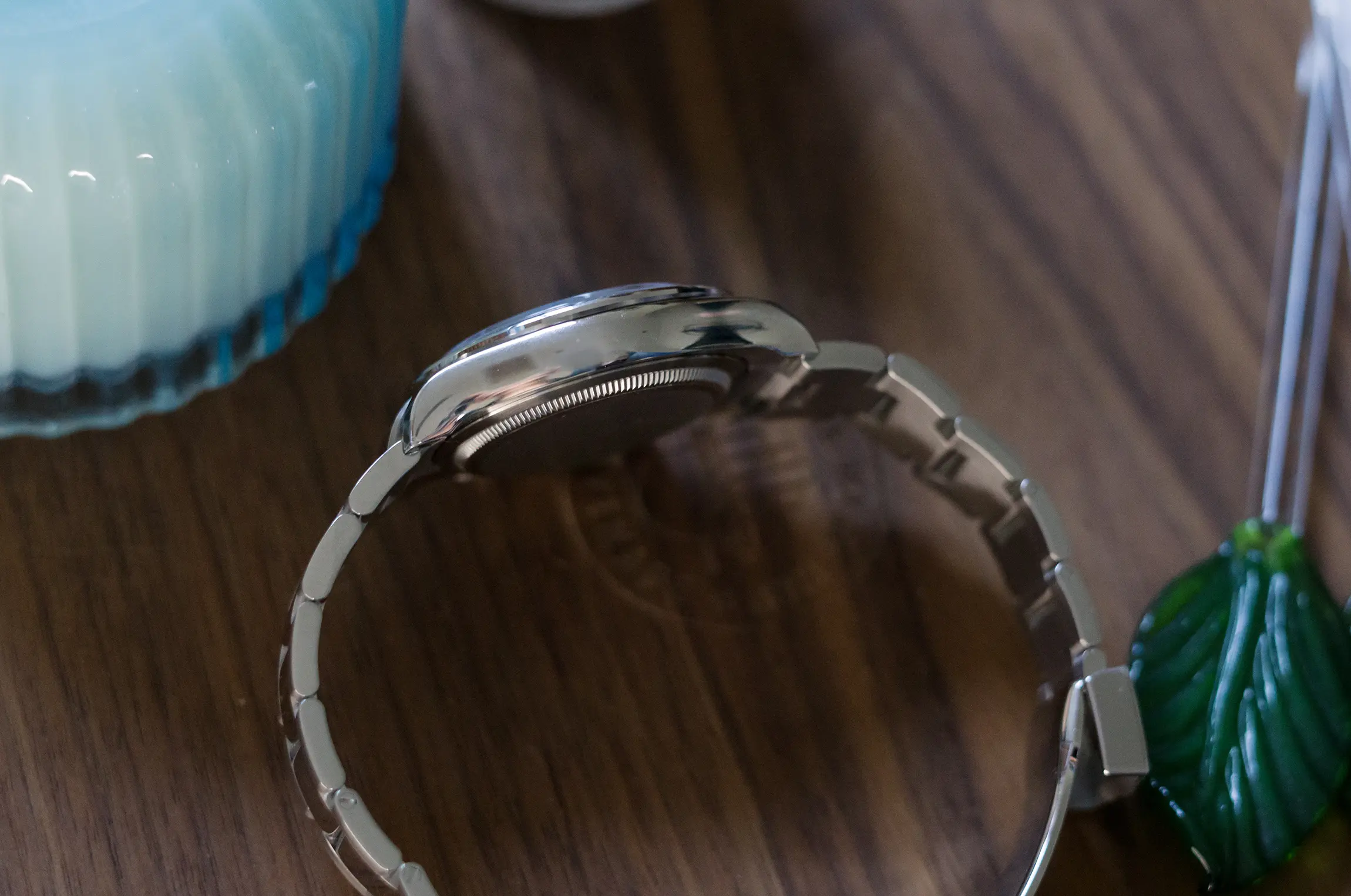
The new Daytona is about the same as the outgoing reference on paper, but there are considerable changes worth noting. Thankfully, the end result is much the same, and the 126500 is still fabulous on wrist, but (spoiler alert) not quite as perfect as the 116500 was. The case measures 40mm according to Rolex, but that’s never quite been accurate at the calipers. The diameter measured from the edge of the bezel is 38.5mm, while the case itself, as measured between 10 and 4 o’clock is ~39mm. From lug to lug we end up with 47.8mm, and the total thickness is 12mm on the nose (slightly thinner than the 116500). There’s nothing wholly remarkable about those numbers, but the shape of the case and undercase are where the real magic happens. They seat into the wrist perfectly, even with the changes that have been made between those numbers.
The outgoing generation of the Daytona made use of two different case styles, one for the steel references, and one for precious metal references. The steel case had a more elegant midcase profile that terminated in pointed lugs. It was also asymmetric by design, meant to shift the visual weight around the crow down pushers and crown. Conversely, the precious metal cases, which were symmetrical, had a more pronounced midcase that terminated in flat feet at the lug. It made for an ever so slightly heftier presence on the wrist, which was obviously overshadowed by the literal heft of the material.
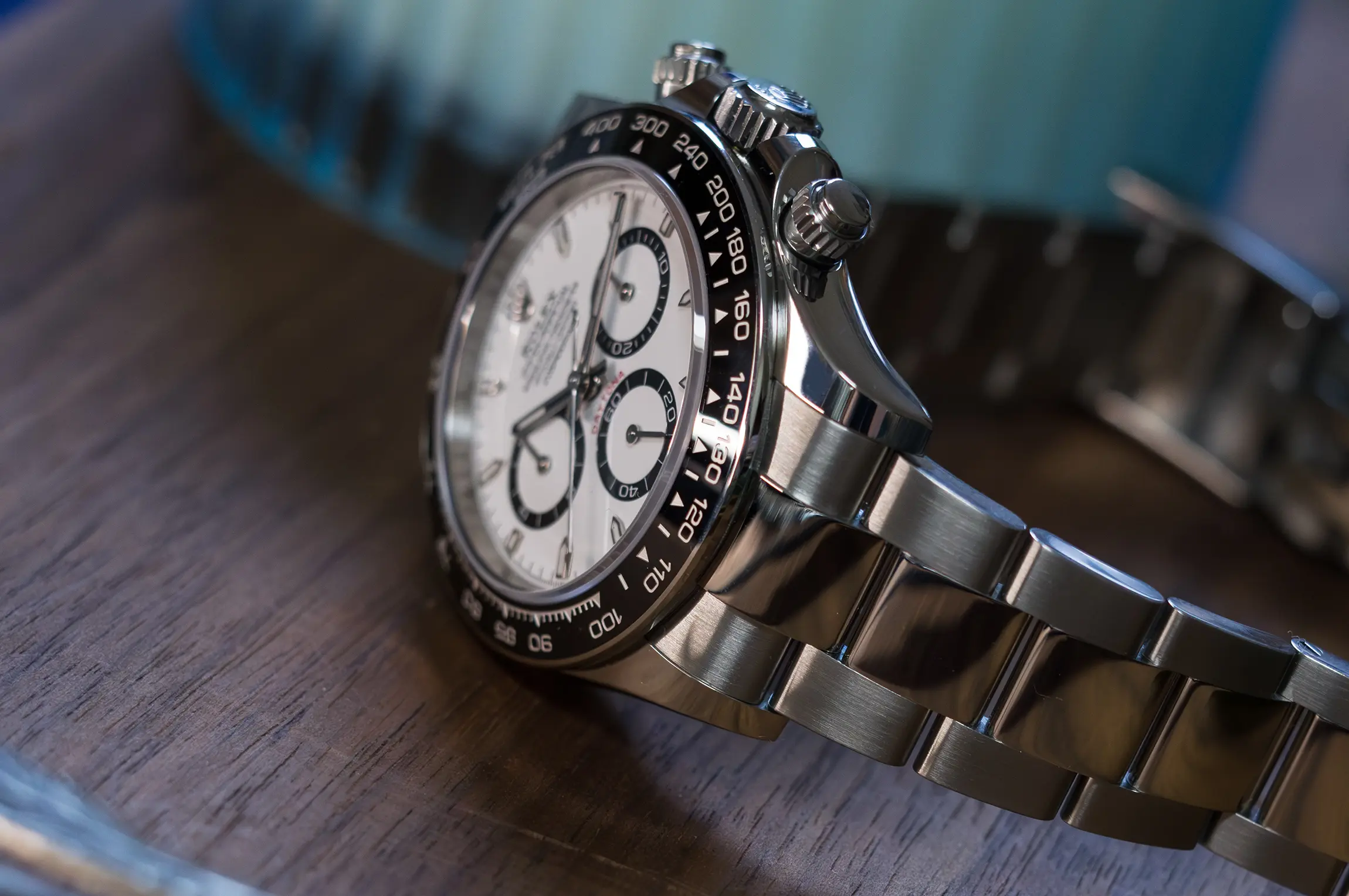
The 126500 makes use of the same case design and profile as the precious metal references, meaning it gets the same set of feet at the button of the lug, and slightly broader presence on the wrist thanks to the now symmetrical design. It’s still a very comfortable watch, but the slight departure is noticeable, and the unique contrast between the configurations has been lost. I’ll be honest and say that I’d have preferred the older design in this case, but in reality is such a minor quibble that more comes down to the aesthetic than it does the on-wrist ramifications. There was something quite graceful about the old midcase that has been lost here. Stepping back, it makes sense that the collection as a whole shares the same case design, but a small part of its personality has been lost in the process.
Yes, the case is still fully polished, and the bracelet still gets a polished center link. As such, it remains a touch on the flashier side compared to older references, but it’s still a very easy watch to wear with a huge cross section of your wardrobe. It still looks great in a t-shirt and jeans, and wouldn’t look entirely out of place dressed to the 9s (though I wouldn’t call it formal wear). This brings us to the daily experience with the 126500, and what it’s like to live with.
To do this, I like to remove a watch from its cultural context and judge it on its own merit, a rather difficult exercise with a watch like the Daytona, but an important one nonetheless. The in-the-moment hype and fantastical second-hand pricing will fade in time, and at that point a watch is laid bare for what it is, good or bad. I’m also making a judgment of the watch at its MSRP, which has risen to $15,100. At the moment, the white dial is hovering around $35,000 and the black dial around $30,000 in the open market, which is a different proposition entirely.
At $15,100, the Daytona remains a very good chronograph for everyday use. Not perfect, but very good. It’s comfortable, it’s highly accurate thanks to the new 4131 movement which offers a healthy 72 hours of reserve on tap, and it’s a pretty good looking watch with plenty of range. Legibility still isn’t all that great, and the screw-down pushers remain slightly impractical for frequent use, and the polished surfaces will invite plenty of swirls and marks (not such a bad thing after enough of them accumulate). Most buyers likely aren’t using the Daytona as their everyday watch, but it certainly could be used that way.
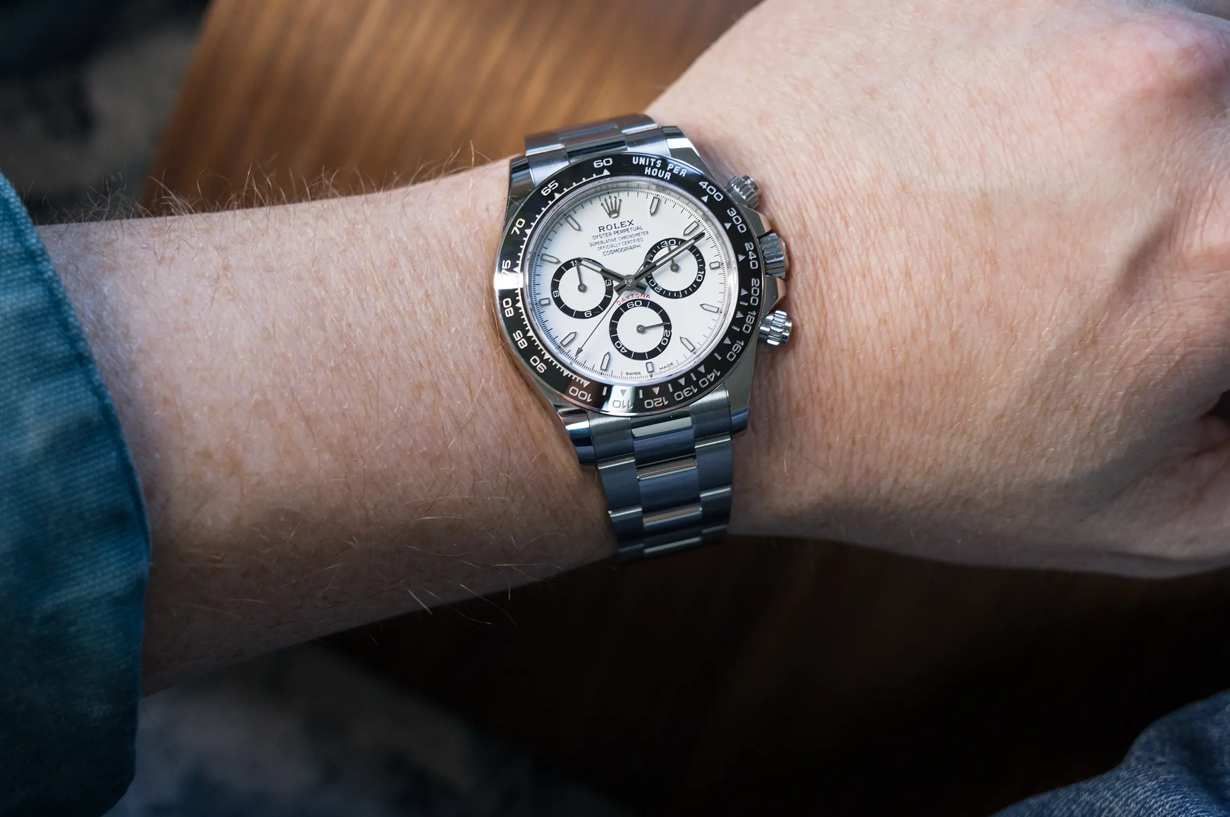
The oyster bracelet seats between the new symmetric lug design better than it did in the prior generation, and wears as well as you might expect. Unfortunately, there is no Glidelock quick adjustment system in the clasp, instead there is only a half-link that can be pulled out or pushed in depending on your needs. This works well, but only if you’re able to size the watch correctly with that half-link pushed in. This will allow you to pull that link out on the fly when you need a little extra room. If, however, you need that half length pulled out to get a proper fit, then you are left with no adjustment options on the fly.
When it comes to chronographs, once you start getting over the $10k mark, the movement becomes a greater source of interest and value. While some of the new Daytonas received open casebacks, the steel 126500 did not, and I honestly prefer it that way. The 4131 is an accumulation of advancements that Rolex has been quietly making to the 4130 for many years, and it now gets a Chronergy escapement fitted with a paramagnetic blue Parachrom hairspring and Paraflex shock absorbers. It is a superlative chronometer, meaning accuracy to within +/- 2 seconds per day, and in my experience it has been well within that. It is exactly what it needs to be for a sporty tool watch, and doesn’t really concern itself with its appearance (though I will say it’s a nice looking utilitarian movement as viewed through the open caseback).
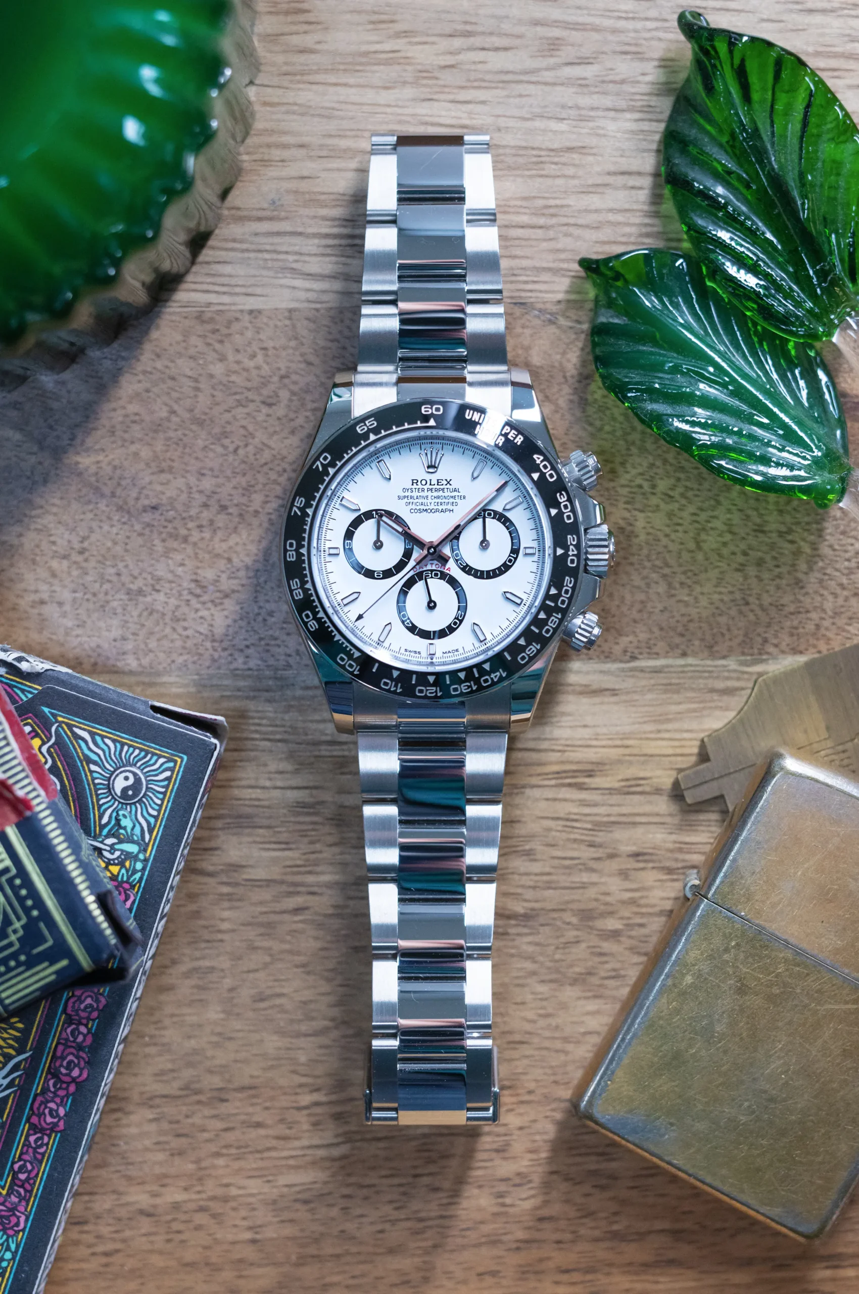
I generally take a view of Rolex watches that aligns with something like a Toyota Hilux truck, they look good because they perform, and they are made to perform in any condition. Yeah they’ve got a bit of flash these days, but they should still be rock solid tools, and watches are what we make of them. In use, the new Daytona feels just as rock solid as it should, and if you can set the reputation aside and live with the polished bits, it’s a great daily companion.
The past 5 years have placed the Daytona into a cultural spotlight, and that’s the other part of the formula that I mentioned at the onset. It is, in some ways, a victim of its own success, now serving as the unwitting poster child of FOMO and hype-driven demand, which is a position that blurs the realities of living with the watch, and how it might work for you as a practical, wearable tool watch. The Daytona has become a barometer for the second hand watch market writ large, and a talking point for speculators and investor types hoping to make a smart buy. Because of this, at the moment I fear we’ve lost sight of the watch underneath, the heritage it represents, and the finer points of Rolex’s evolutionary approach to the collection. But a good watch will persevere, even if it has been placed in an unfair position, and the Daytona is certainly that. Rolex is always playing the long game, and when it comes to how we engage with and use these things in our own lives, I think it’s wise we do the same.
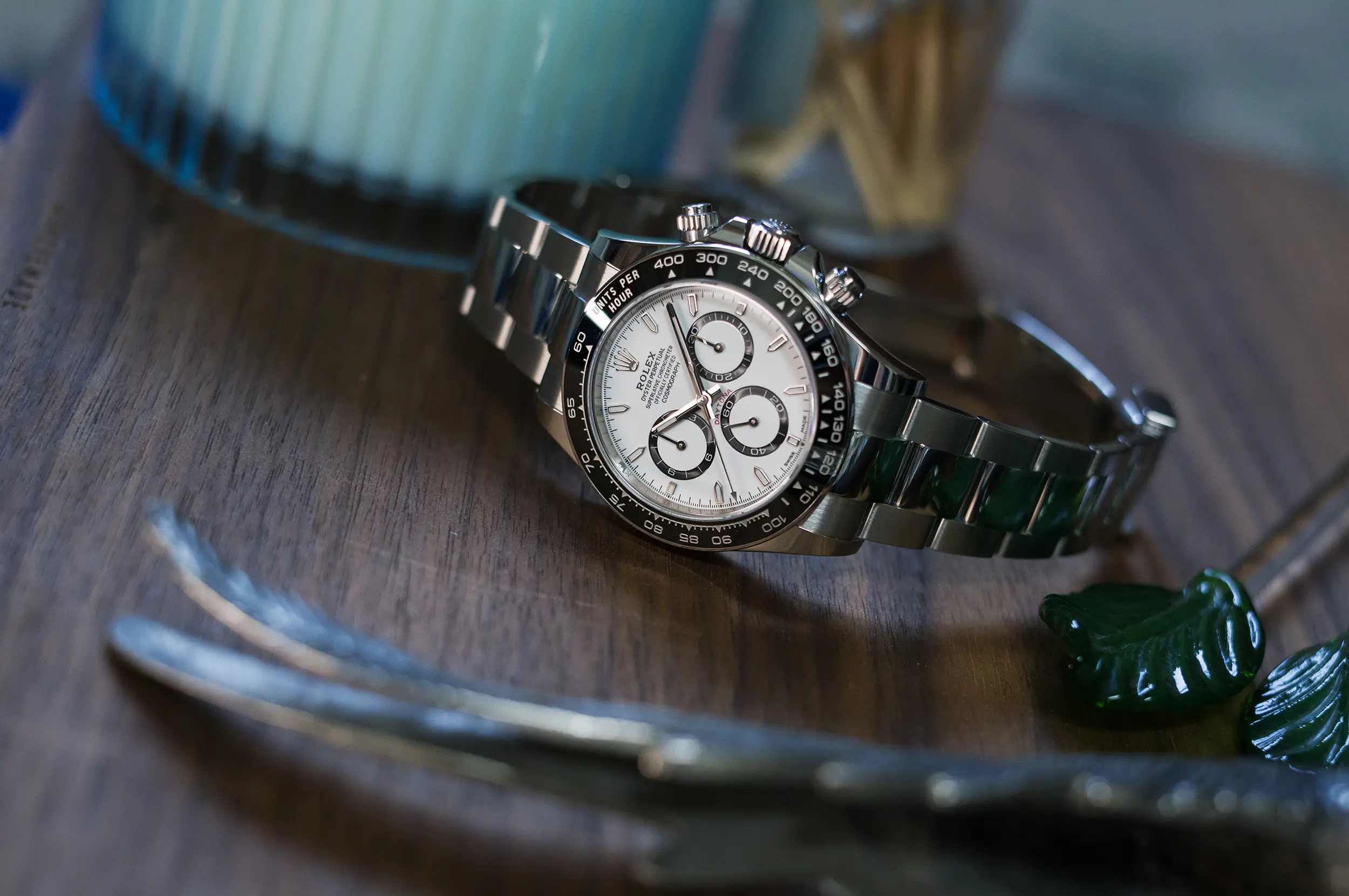
The new 126500 takes a step away from the 116500 before it, and a step closer to its roots. This watch does a better job of embracing its lineage, and in the process places some distance between itself and the prior generation, including the baggage surrounding it. Rolex is reclaiming its identity with the new generation of watches in a process that began years ago. The new Daytona collection represents a subtle shift aesthetically and functionally, but more importantly, I see it marking a philosophical shift in the way Rolex approaches watches in general. What began with the 126600 and 124270 has now taken root in the 126500, proving exactly the kind of reset that Rolex and their Daytona needed.

