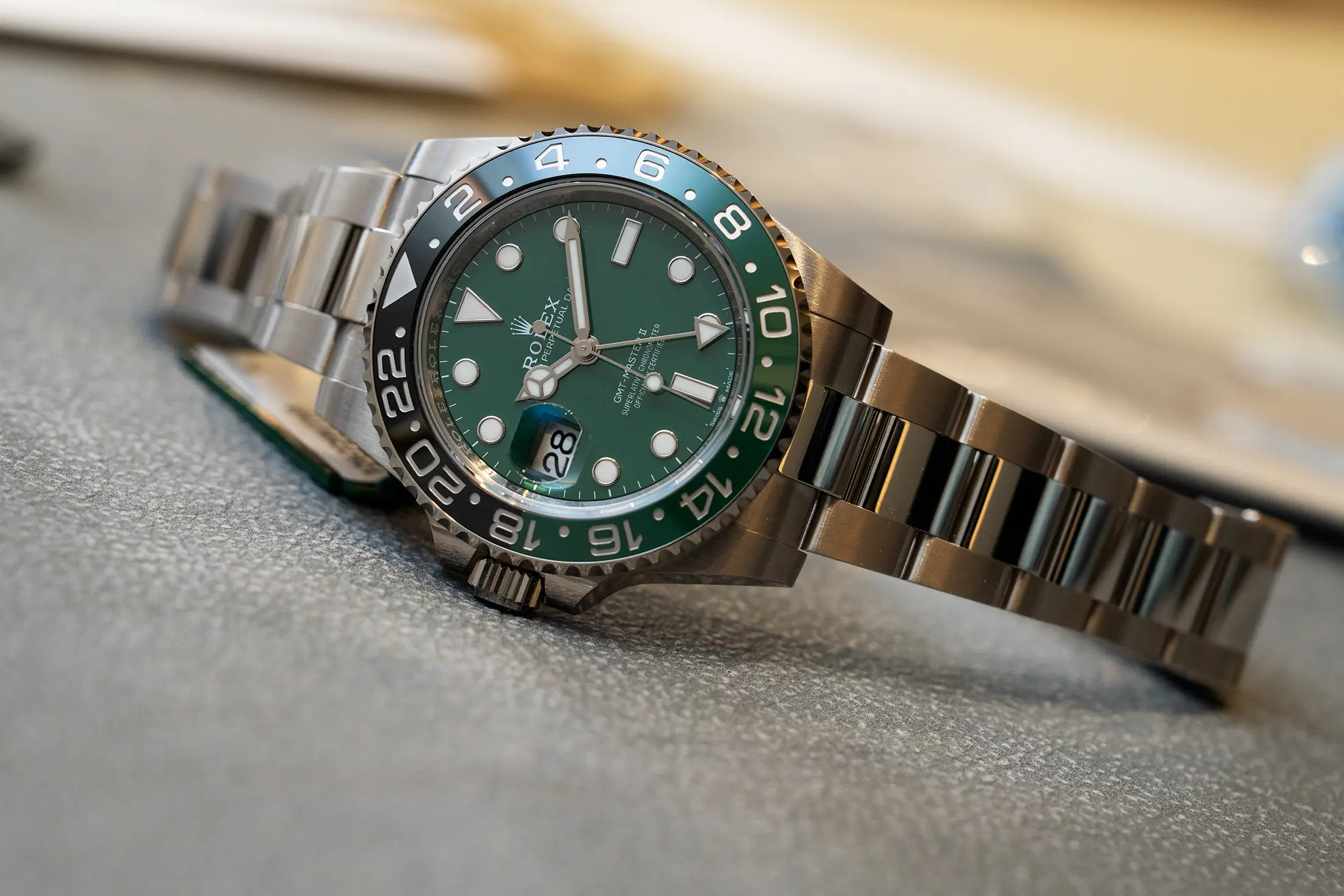
This year is the officially recognized 70th anniversary of the Rolex GMT-Master, but you’d never know it by talking to Rolex. The brand celebrated the history of the collection at the 2024 Watches & Wonders show, and this year, they’ve released what could be seen as an anniversary model in the new reference 126729VTNR. The new Land-Dweller collection is undoubtedly the feature release this year, and for good reason (hands-on with that watch coming soon), but this GMT also brings something new to the table by house Rolex’s first dial made of Cerachrom, the same material as the bezel. Whatever your thoughts on the lefty crown or the black and green colorway, this move represents a big step that we’ll likely see built on in the future.
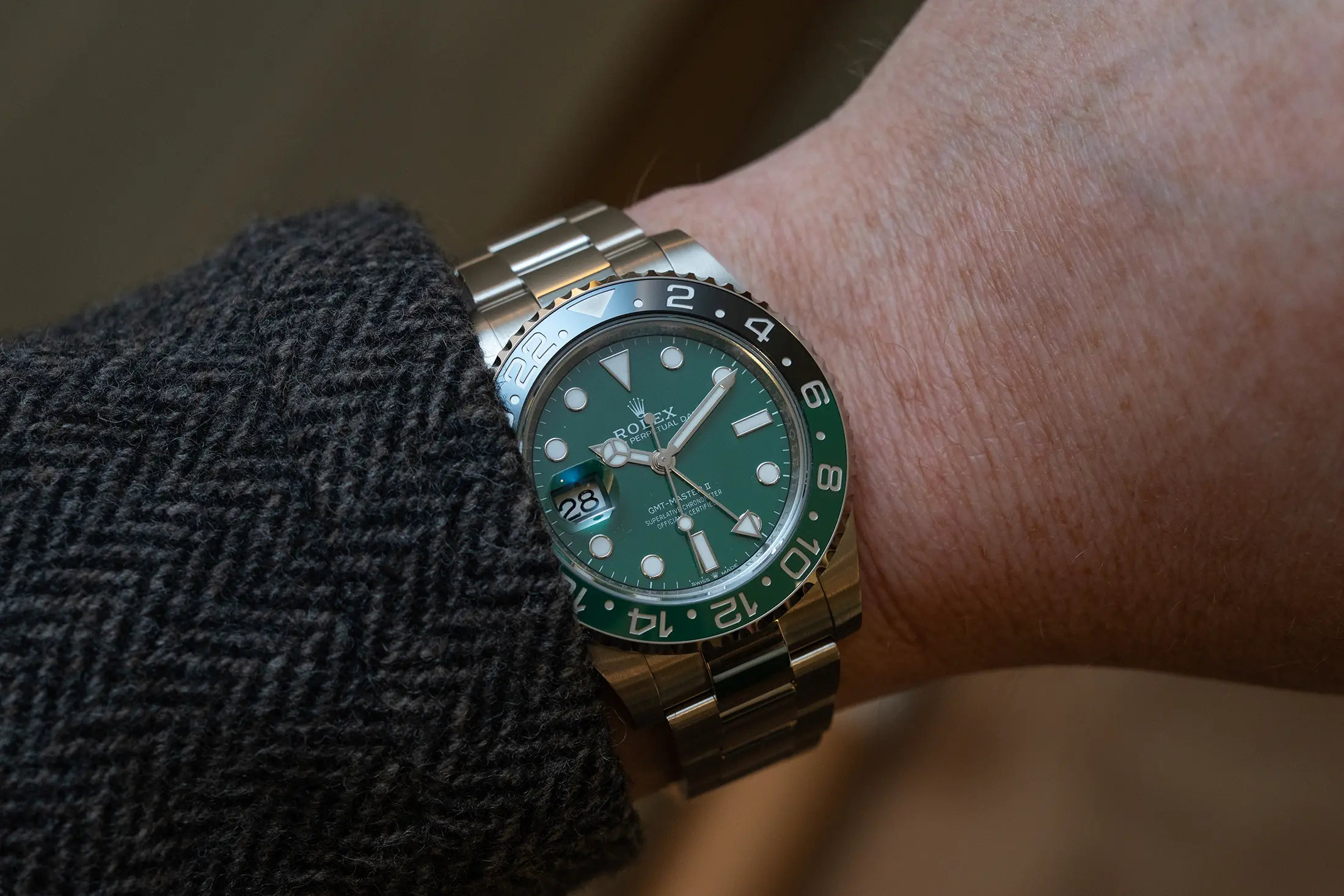
The dial itself is quite captivating in person. It’s soft, and almost matte in most light, and doesn’t feel quite as saturated as what you see in the marketing materials. Theoretically, it’s the same green as the bottom portion of the dial, but it doesn’t really read that way upon closer inspection. The soft quality of the way the color is rendered feels a bit old-school, and I could easily see it being an execution that they need to dial in to get the desired look, a bit like the early releases of the Cerachrome BLRO bezels. That said, I really, really like the way it looks here.
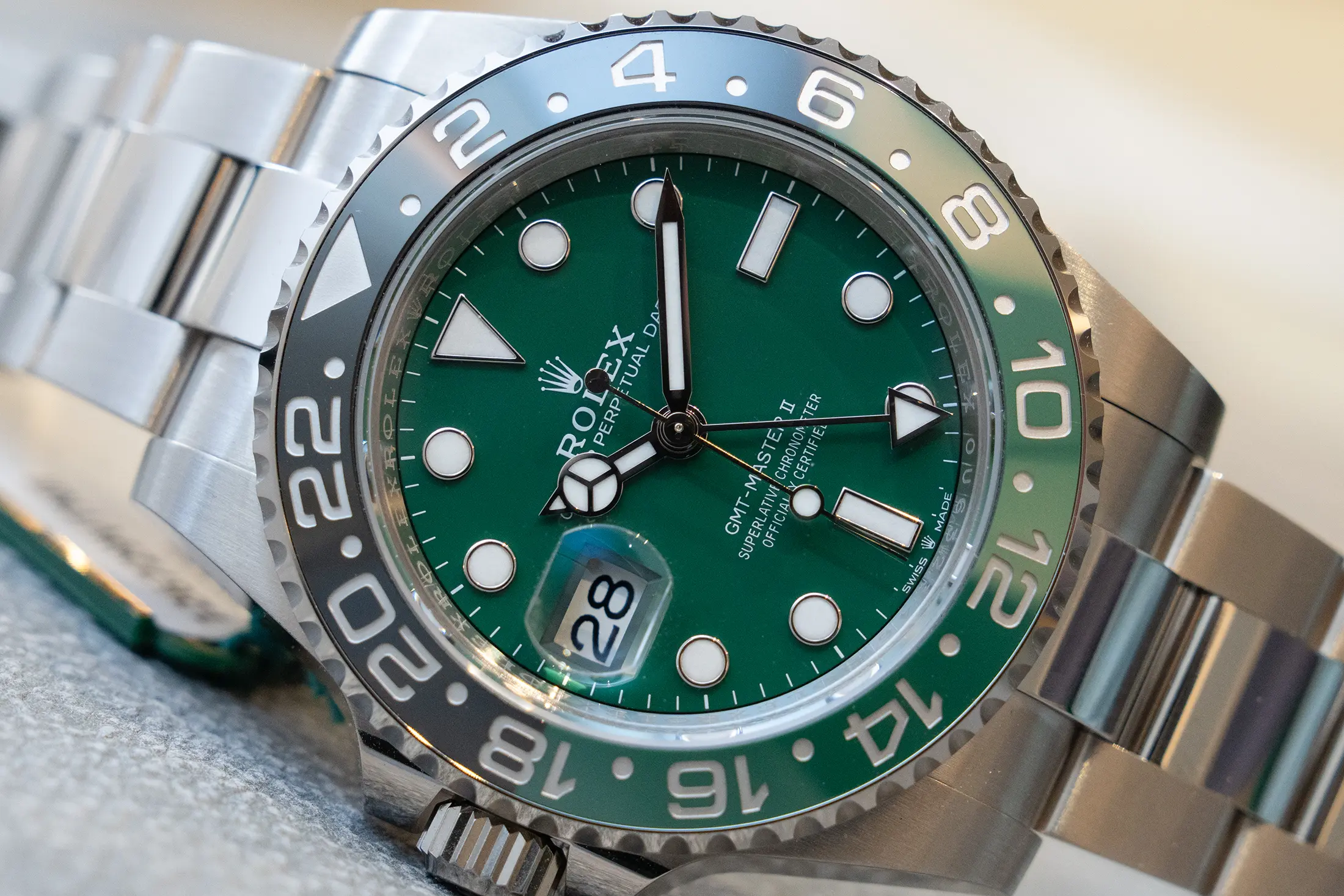
The rest of the watch is the same as the other GMT-Master II references we’ve known for years. The case may be white gold, but the 40mm design is unchanged, and the caliber 3285 still beats away on the inside. The left handed configuration with the same VTNR bezel was first released in 2022, and was quite a surprise when released. It has since found a regular place within the collection, and it was a natural starting point for an anniversary expression given the use of green, which often features in these models.
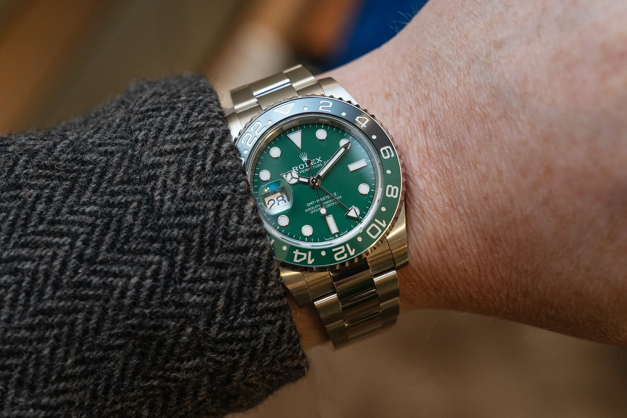
The green Cerachrome dial is the real star with this watch, setting aside the collection’s illustrious history for a moment to just take this watch for what it is. As much as I like this dial as seen here, my mind immediately wonders how it will be utilized in future expressions and colors, and even what other collections we might see it appear in. The Day-Date, Oyster Perpetual, and Daytona collections immediately spring to mind given their use of big colors, but I also think they could leverage this method to achieve a more subdued look within the Submariner, Yacht-Master, or Explorer collections. This reads a bit like a matte dial, and that’s a feature many of us would love to see make a return in the above collections.
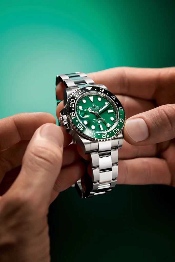
Like many of the watches seen this year, this watch makes a much deeper impression in the metal as compared to the images posted online. I hope this one isn’t a rare sight in the wild, though I have a suspicion that it will be just that. Take my word for it, this one is worth seeing should you ever get the opportunity. My fingers are crossed that it will make its way into a steel reference sometime soon. Rolex

