
Parmigiani quietly had another stellar year of releases in Geneva last week, not only bolstering their Tonda collection with new openworked and GMT Rattrapantte models, but also in their still new Toric collection with a pair of new perpetual calendar references. Last year, the new Toric was launched as a reconnection with the brand’s roots, and the watch was universally lauded as one of the most beautiful releases of the year. It was easily one of my favorites and I’m happy to see Parmigiani begin to flesh out the collection with a pair of equally stunning perpetual calendar designs.
The design of the time-only Toric works so well because of the manner in which it achieves balance within a very simple framework. It’s not minimal, as the use of color, textures, finishes, and shapes all play a big role in making the elements present all sing together. These are the trickiest designs to get right, but Parmigiani managed just that with the Toric. So how then would the same level of simple refinement be achieved with the addition of a full calendar? Parmigiani has stuck to the same principles that made the original great, taking a largely reductive approach without sacrificing any of the practical benefits that come from having a perpetual calendar.
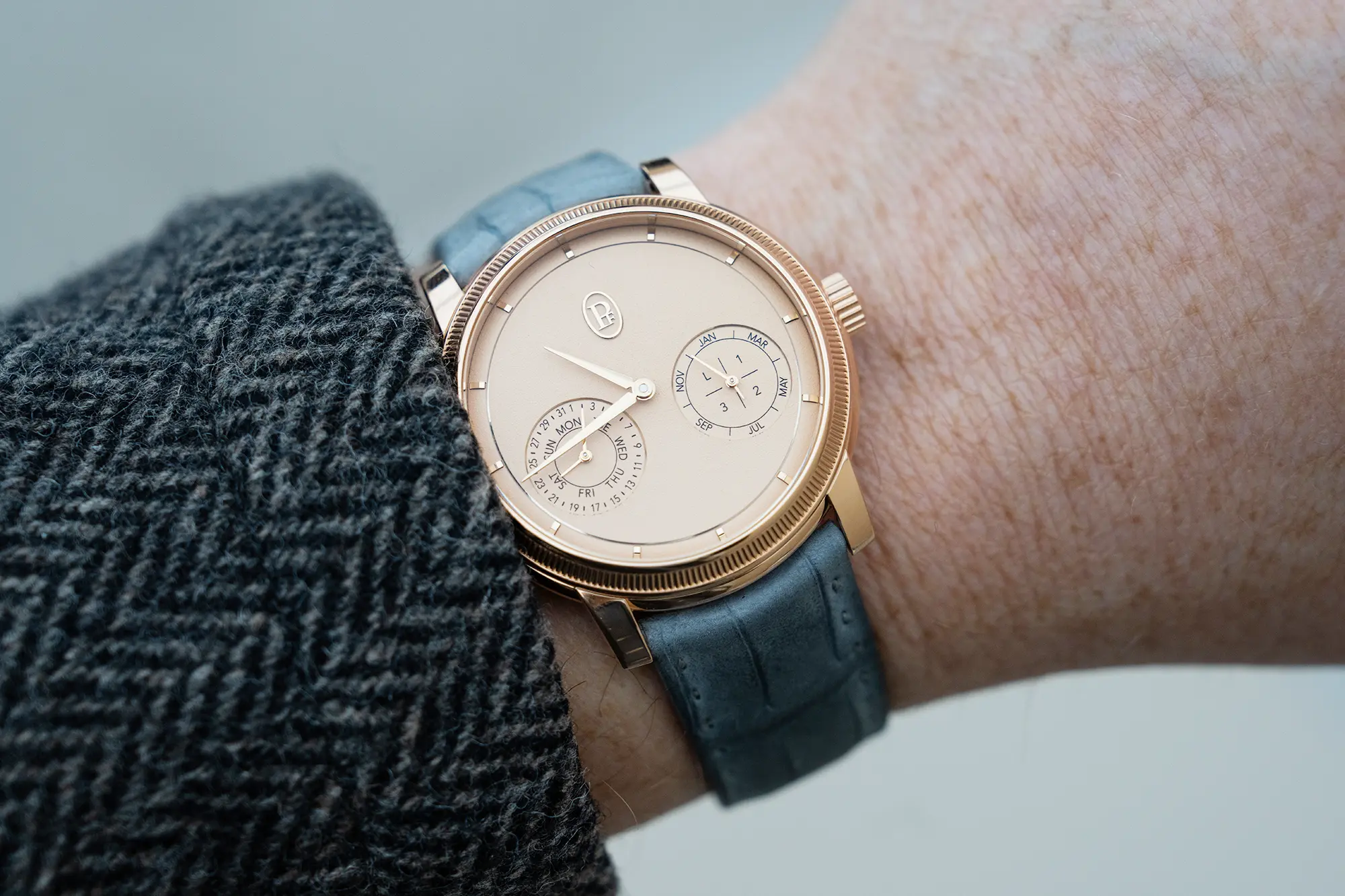
The Toric Quantieme Perpetuel takes a careful approach to retain the identity put forth in the original last year. There are no superfluous details here, and the addition of the calendar display doesn’t seem to interfere with the serenity of the color selection or the textures at work. Additionally, the layout chosen even adds some new lore to the design language that could be built on moving ahead.
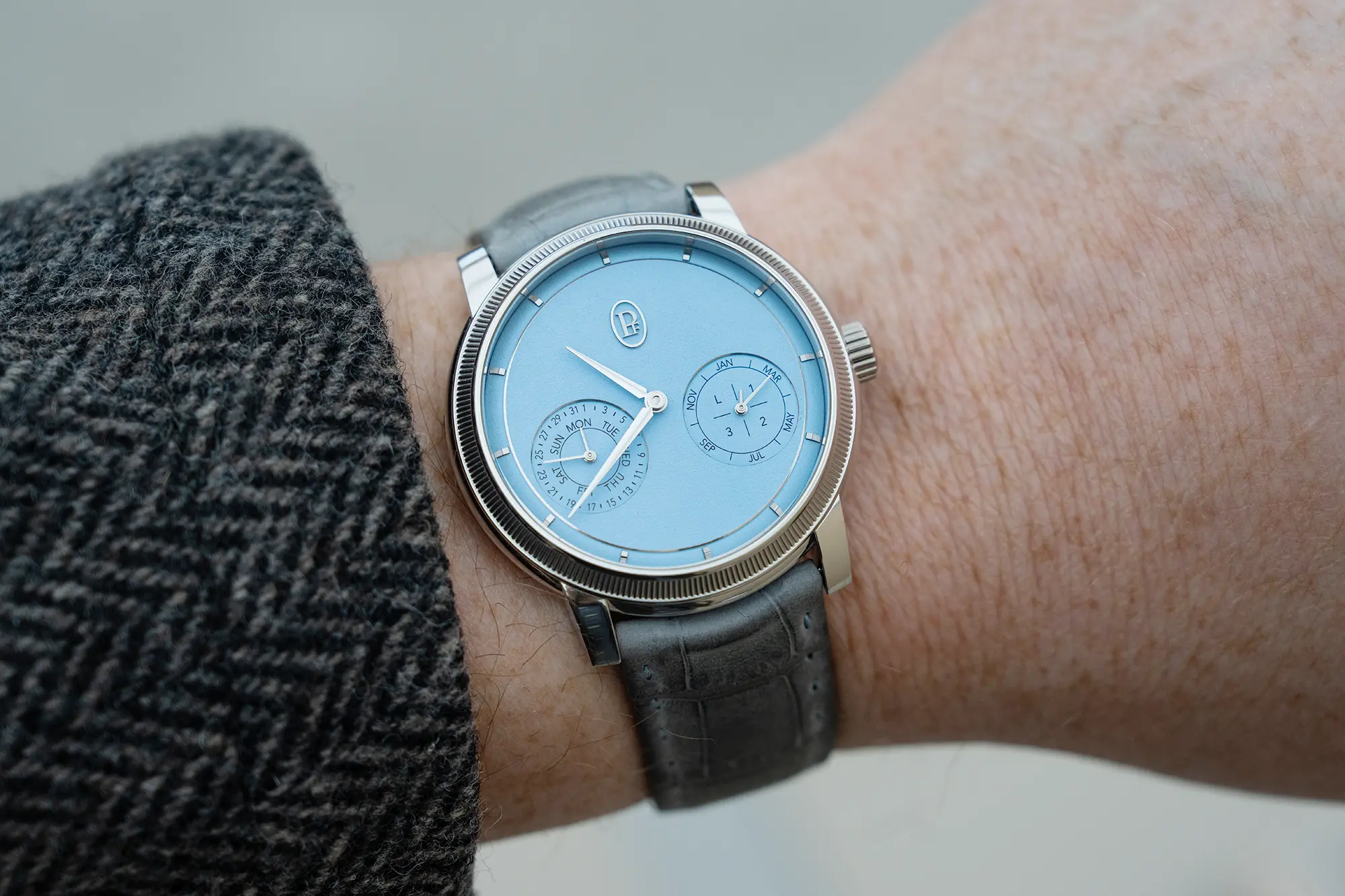
Parmigiani is using two sub-dials placed well below the centerline of the dial, which are balanced in a triangular fashion against the applied brand logo at 12 o’clock. A. Lange & Sohne used a similar method with the Datograph which placed an oversized date at the top of the dial. Those two sub-dials present all of the information necessary to effectively convey calendar functions, with the day and date presented at the left, and the month on the right, with a nested leap year indication. No other chapter rings or labels are required. It’s a beautiful solution, and it works in this format to preserve the Toric identity.
One of the most distinctive and important features of the Toric when it was released last year were the color and texture of the dials. There was a serene quality to them, and while they were subtle, they begged a closer look, and even forced a level of introspection in a way. It’s a similar story with the Quantieme Perpetuel, which offers a bright blue dial, and a light champagne dial, each with a hand grained dial that looks a bit like very fine grit sandpaper. Both are totally beautiful in the metal, especially against the carefully selected strap tones to which they are paired.
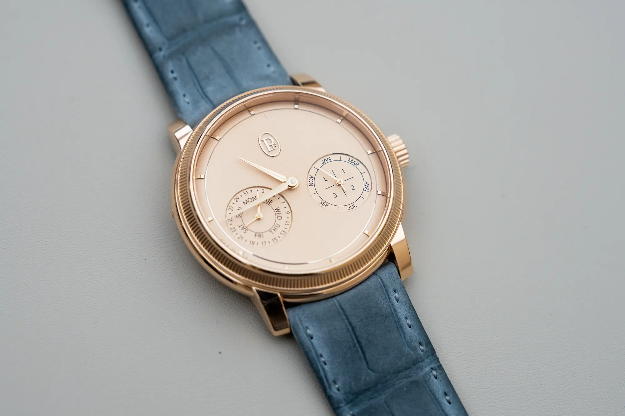
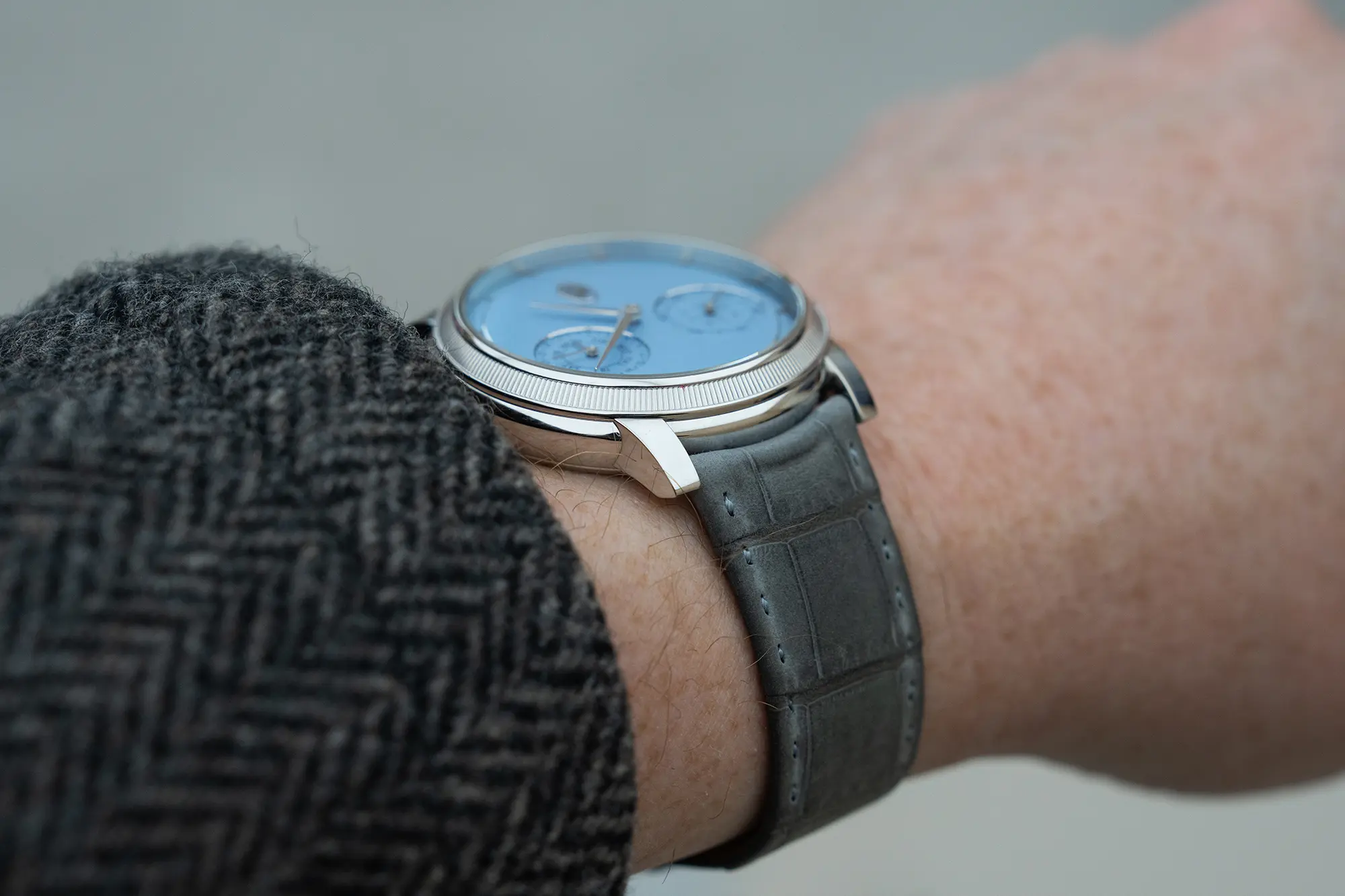
Each dial gets a precious metal case that measures 40.6mm in diameter, and 10.9mm in thickness. The case curves like a pebble at the edges, with a coin-edge bezel framing the dial, and a straight lug that clips into the curvature. It’s large, but not overbearing. It’s also quite comfortable thanks to the shape of the case. Like the dial, it’s clear that a lot of thought went into the smallest details, and the sum of all these decisions is transcendent.
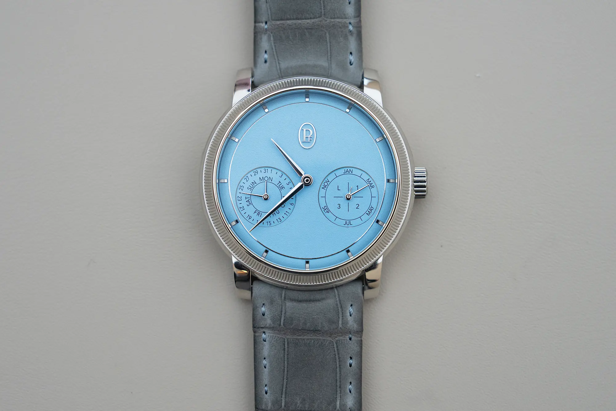
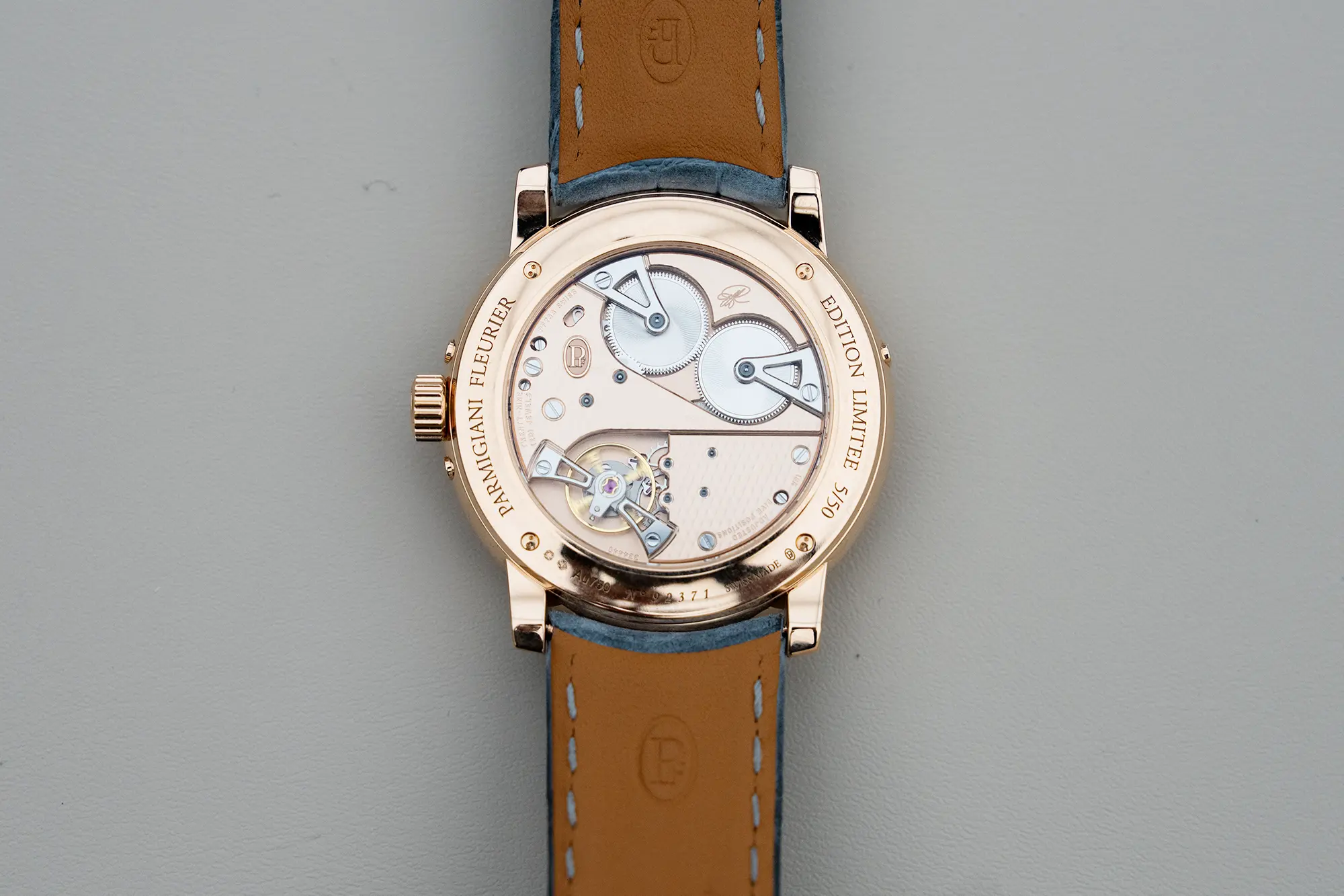
Inside is Parmigiani’s caliber PF733, which uses rose gold for the plates and bridges. The placement and finishes at work are unique to Parmigiani, and Michel Parmigiani’s signature remains between the two barrels. Like the Petite Second watches released last year, this movement uses the brand’s Côtes de Fleurier decorative finish that is also quite subtle in nature.
Parmigiani will produce just 50 examples of each of these watches, and pricing is set at CHF 92,000. Parmigiani Fleurier